Self-test Solutions

Nestled within the chapters of Discovering Statistics Using IBM SPSS Statistics (6th edition) are questions that prompt you to think about the material. This page has the solutions to those questions.
Chapter 1
Self-test 1.1
Based on what you have read in this section, what qualities do you think a scientific theory should have?
A good theory should do the following:
- Explain the existing data.
- Explain a range of related observations.
- Allow statements to be made about the state of the world.
- Allow predictions about the future.
- Have implications.
Self-test 1.2
What is the difference between reliability and validity?
Validity is whether an instrument measures what it was designed to measure, whereas reliability is the ability of the instrument to produce the same results under the same conditions.
Self-test 1.3
Why is randomization important?
It is important because it rules out confounding variables (factors that could influence the outcome variable other than the factor in which you’re interested). For example, with groups of people, random allocation of people to groups should mean that factors such as intelligence, age and gender are roughly equal in each group and so will not systematically affect the results of the experiment.
Self-test 1.4
Compute the mean but excluding the score of 234.
\[ \begin{aligned} \overline{X} &= \frac{\sum_{i=1}^{n} x_i}{n} \\ \ &= \frac{22+40+53+57+93+98+103+108+116+121}{10} \\ \ &= \frac{811}{10} \\ \ &= 81.1 \end{aligned} \]
Self-test 1.5
Compute the range but excluding the score of 234.
Range = maximum score - minimum score = 121 − 22 = 99.
Self-test 1.6
Twenty-one heavy smokers were put on a treadmill at the fastest setting. The time in seconds was measured until they fell off from exhaustion: 18, 16, 18, 24, 23, 22, 22, 23, 26, 29, 32, 34, 34, 36, 36, 43, 42, 49, 46, 46, 57. Compute the mode, median, mean, upper and lower quartiles, range and interquartile range
First, let’s arrange the scores in ascending order: 16, 18, 18, 22, 22, 23, 23, 24, 26, 29, 32, 34, 34, 36, 36, 42, 43, 46, 46, 49, 57.
- The mode: The scores with frequencies in brackets are: 16 (1), 18 (2), 22 (2), 23 (2), 24 (1), 26 (1), 29 (1), 32 (1), 34 (2), 36 (2), 42 (1), 43 (1), 46 (2), 49 (1), 57 (1). Therefore, there are several modes because 18, 22, 23, 34, 36 and 46 seconds all have frequencies of 2, and 2 is the largest frequency. These data are multimodal (and the mode is, therefore, not particularly helpful to us).
- The median: The median will be the (n + 1)/2th score. There are 21 scores, so this will be the 22/2 = 11th. The 11th score in our ordered list is 32 seconds.
- The mean: The mean is 32.19 seconds:
\[ \begin{aligned} \overline{X} &= \frac{\sum_{i=1}^{n} x_i}{n} \\ \ &= \frac{16+(2\times18)+(2\times22)+(2\times23)+24+26+29+32+(2\times34)+(2\times36)+42+43+(2\times46)+49+57}{21} \\ \ &= \frac{676}{21} \\ \ &= 32.19 \end{aligned} \]
- The lower quartile: This is the median of the lower half of scores. If we split the data at 32 (not including this score), there are 10 scores below this value. The median of 10 scores is the 11/2 = 5.5th score. Therefore, we take the average of the 5th score and the 6th score. The 5th score is 22, and the 6th is 23; the lower quartile is therefore 22.5 seconds.
- The upper quartile: This is the median of the upper half of scores. If we split the data at 32 (not including this score), there are 10 scores above this value. The median of 10 scores is the 11/2 = 5.5th score above the median. Therefore, we take the average of the 5th score above the median and the 6th score above the median. The 5th score above the median is 42 and the 6th is 43; the upper quartileis therefore 42.5 seconds.
- The range: This is the highest score (57) minus the lowest (16), i.e. 41 seconds. _ The interquartile range: This is the difference between the upper and lower quartiles: 42.5 − 22.5 = 20 seconds.
Self-test 1.7
Assuming the same mean and standard deviation for the ice bucket example above, what’s the probability that someone posted a video within the first 30 days of the challenge?
As in the example, we know that the mean number of days was 39.68, with a standard deviation of 7.74. First we convert our value to a z-score: the 30 becomes (30−39.68)/7.74 = −1.25. We want the area below this value (because 30 is below the mean), but this value is not tabulated in the Appendix. However, because the distribution is symmetrical, we could instead ignore the minus sign and look up this value in the column labelled ‘Smaller Portion’ (i.e. the area above the value 1.25). You should find that the probability is 0.10565, or, put another way, a 10.57% chance that a video would be posted within the first 30 days of the challenge. By looking at the column labelled ‘Bigger Portion’ we can also see the probability that a video would be posted after the first 30 days of the challenge. This probability is 0.89435, or a 89.44% chance that a video would be posted after the first 30 days of the challenge.
Chapter 2
Self-test 2.1
In Section 1.6.2.2 we came across some data about the number of friends that 11 people had on Facebook. We calculated the mean for these data as 95 and standard deviation as 56.79. Calculate a 95% confidence interval for this mean. Recalculate the confidence interval assuming that the sample size was 56.
To calculate a 95% confidence interval for the mean, we begin by calculating the standard error:
\[ SE = \frac{s}{\sqrt{N}} = \frac{56.79}{\sqrt{11}}=17.12 \]
The sample is small, so to calculate the confidence interval we need to find the appropriate value of t. For this we need the degrees of freedom, N – 1. With 11 data points, the degrees of freedom are 10. For a 95% confidence interval we can look up the value in the column labelled ‘Two-Tailed Test’, ‘0.05’ in the table of critical values of the t-distribution (Appendix). The corresponding value is 2.23. The confidence interval is, therefore, given by:
\[ \begin{aligned} \text{lower boundary of confidence interval} &= \bar{X}-(2.23 \times 17.12) \\ &= 95 - (2.23 \times 17.12) \\ & = 56.82 \\ \text{upper boundary of confidence interval} &= \bar{X}+(2.23 \times 17.12) \\ &= 95 + (2.23 \times 17.12) \\ &= 133.18 \end{aligned} \]
Assuming now a sample size of 56, we need to calculate the new standard error:
\[ SE = \frac{s}{\sqrt{N}} = \frac{56.79}{\sqrt{56}}=7.59 \]
The sample is big now, so to calculate the confidence interval we can use the critical value of z for a 95% confidence interval (i.e. 1.96). The confidence interval is, therefore, given by:
\[ \begin{aligned} \text{lower boundary of confidence interval} &= \bar{X}-(1.96 \times 7.59) = 95 - (1.96 \times 7.59) = 80.1 \\ \text{upper boundary of confidence interval} &= \bar{X}+(1.96 \times 7.59) = 95 + (1.96 \times 7.59) = 109.8 \end{aligned} \]
Self-test 2.2
What are the null and alternative hypotheses for the following questions: (1) ‘Is there a relationship between the amount of gibberish that people speak and the amount of vodka jelly they’ve eaten?’ (2) ‘Does reading this chapter improve your knowledge of research methods?’
‘Is there a relationship between the amount of gibberish that people speak and the amount of vodka jelly they’ve eaten?’
- Null hypothesis: There will be no relationship between the amount of gibberish that people speak and the amount of vodka jelly they’ve eaten.
- Alternative hypothesis: There will be a relationship between the amount of gibberish that people speak and the amount of vodka jelly they’ve eaten.
‘Does reading this chapter improve your knowledge of research methods?’
- Null hypothesis: There will be no difference in the knowledge of research methods in people who have read this chapter compared to those who have not.
- Alternative hypothesis: Knowledge of research methods will be in those who have read the chapter compared to those who have not.
Self-test 2.3
Compare the plots in Figure 2.16. What effect does the difference in sample size have? Why do you think it has this effect?
The plot showing larger sample sizes has smaller confidence intervals than the plot showing smaller sample sizes. If you think back to how the confidence interval is computed, it is the mean plus or minus 1.96 times the standard error. The standard error is the standard deviation divided by the square root of the sample size (√N), therefore as the sample size gets larger, the standard error (and, therefore, confidence interval) will get smaller.
Chapter 3
Self-test 3.1
Based on what you have learnt so far, which of the following statements best reflects your view of antiSTATic? (A) The evidence is equivocal, we need more research. (B) All of the mean differences show a positive effect of antiSTATic, therefore, we have consistent evidence that antiSTATic works. (C) Four of the studies show a significant result (p < .05), but the other six do not. Therefore, the studies are inconclusive: some suggest that antiSTATic is better than placebo, but others suggest there’s no difference. The fact that more than half of the studies showed no significant effect means that antiSTATic is not (on balance) more successful in reducing anxiety than the control. (D) I want to go for C, but I have a feeling it’s a trick question.
If you follow NHST you should pick C because only four of the six studies have a ‘significant’ result, which isn’t very compelling evidence for antiSTATic.
Self-test 3.2
Now you’ve looked at the confidence intervals, which of the earlier statements best reflects your view of Dr Weeping’s potion?
I would hope that some of you have changed your mind to option B: 10 out of 10 studies show a positive effect of antiSTATic (none of the means are below zero), and even though sometimes this positive effect is not always ‘significant’, it is consistently positive. The confidence intervals overlap with each other substantially in all studies, suggesting that all studies have sampled the same population. Again, this implies great consistency in the studies: they all throw up (potential) population effects of a similar size. Look at how much of the confidence intervals are above zero across the 10 studies: even in studies for which the confidence interval includes zero (implying that the population effect might be zero) the majority of the bar is greater than zero. Again, this suggests very consistent evidence that the population value is greater than zero (i.e. antiSTATic works).
Self-test 3.3
Compute Cohen’s d for the effect of singing when a sample size of 100 was used (right-hand plot in Figure 2.21).
\[ \begin{aligned} \hat{d} &= \frac{\bar{X}_\text{singing}-\bar{X}_\text{conversation}}{\sigma} \\ &= \frac{10-12}{3} \\ &= 0.667 \end{aligned} \]
Self-test 3.4
Compute Cohen’s d for the effect in Figure 2.22. The exact mean of the singing group was 10, and for the conversation group was 10.01. In both groups the standard deviation was 3.
\[ \begin{aligned} \hat{d} &= \frac{\bar{X}_\text{singing}-\bar{X}_\text{conversation}}{\sigma} \\ &= \frac{10-10.01}{3} \\ &= -0.003 \end{aligned} \]
Self-test 3.5
Look at Figures 2.22 and Figure 2.23. Compare what we concluded about these three data sets based on p-values, with what we conclude using effect sizes.
Answer given in the text.
Self-test 3.6
Look back at Figure 3.2. Based on the effect sizes, is your view of the efficacy of the potion more in keeping with what we concluded based on p-values or based on confidence intervals?
Answer given in the text.
Self-test 3.7
Use Table 3.2 and Bayes’ theorem to calculate p(human |match).
Answer given in the text.
Self-test 3.8
What are the problems with NHST?
Answer given in the text.
Chapter 4
Self-test 4.1
Now try creating the variable
death_dateusing what you have learned.
First, move back to the variable view using the tab at the bottom of the data editor ( ). Move to the cell in row 3 of the column labelled Name (under the previous variable you created). Type ‘death_date’. Move into the column labelled
  using the → key on the keyboard. The cell you have moved into will indicate the default of
  , and to change this click
  to activate the Variable Type dialog box, and click
  . On the right of the dialog box is a list of date formats, from which you can choose your preference; being British, I am used to the day coming before the month and have chosen dd-mmm-yyyy (i.e., 26-Dec-1963), but Americans, for example, more often put the month before the date so might select mm/dd/yyyy (12/26/1963). When you have selected a date format, click
  to return to the variable view. Finally, move to the cell in the column labelled Label and type ‘Date of death’.
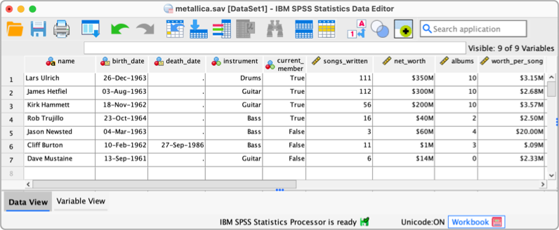
Once the variable has been created, return to the data view by clicking on the ‘Data View’ tab ( ). The third column now has the label
 death_date; click the white cell in the row for Cliff Burton and type the value, 27-09-1986. To register this value in this cell, move down to the next cell by pressing the ↓ key. Note that SPSS automatically changes the 09 to ‘Sep’.
Self-test 4.2
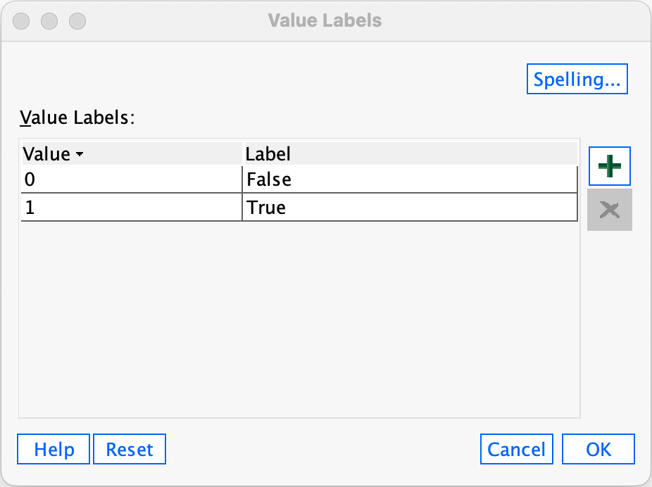
Using what you have learned try creating the variable current_member using codes and labels of 1 = True and 0 = False.
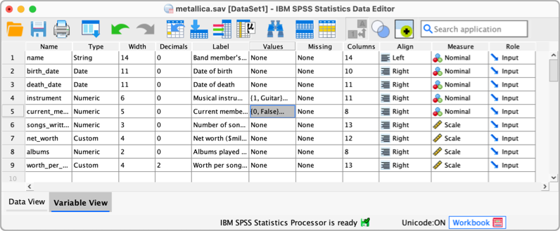
To create the current_member go to the variable view (), move to the first empty cell under the column labelled Name (this should be the cell under instrument. Type current_member into this empty cell. Move along the row to the column called Label and give the variable a full description such as Current Member of the Band. To define the group codes, move along the row to the column labelled  . The cell will indicate the default of
  . Click to access the Value Labels dialog box (see Figure 4.10 in book).
To add a category and attach a value and label click  . A new row will be created in the table in the dialog box with an empty cell under the column labelled Value and another under the column labelled Label. We want to create two categories (True and False) so we can click twice to create the necessary rows. Click on the first empty cell in the Value column and type a code (in this case 0), then press ↓ to move to the cell underneath and type the next code (in this case 1). Having set the numeric values for the categories, we assign each category a label by filling in the cells of the Label column. Click on the first empty cell in this column and type a descriptive label (in this case ‘False’), then press ↓ to move to the cell underneath and type the next label (‘True’). The completed dialog box should look like this:
 {widt =“300px”}
Click to return to the variable view. Now set the level of measurement for the variable to nominal by going to the column labelled Measure and selecting  from the drop-down list.
Self-test 4.3
Why is the
songs_writtenvariable a ‘scale’ variable?
It is a scale variable because the numbers represent consistent intervals and ratios along the measurement scale: the difference between having written (for example) 1 and 2 songs is the same as the difference between having written (for example) 10 and 11 songs, and a band member who has written (for example) 20 songs has written twice as many as a band mamber who has written only 10 songs.
Self-test 4.4
Having created the first four variables with a bit of guidance, try to enter the rest of the variables in Table 3.1 yourself.
The finished data and variable views should look like those in the figures below (more or less!). You can also download the data file (metallica.sav)
Chapter 5
Self-test 5.1
What does a histogram show?
A histogram plots the values of observations on the horizontal x-axis, and the frequency with which each value occurs in the data set on the vertical y-axis.
Self-test 5.2
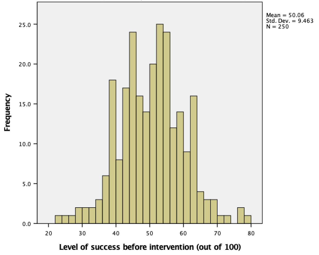
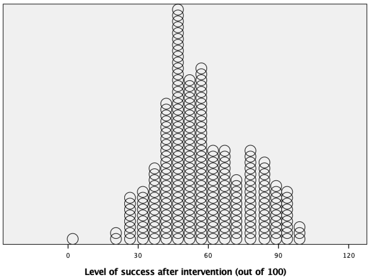
Produce a histogram and population pyramid for the success scores before the intervention.
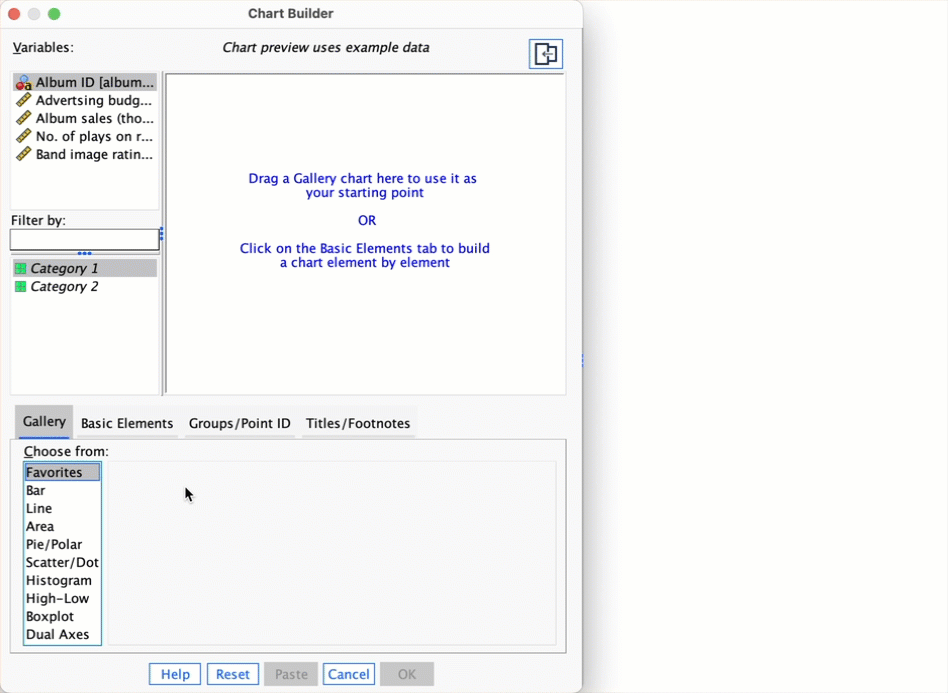
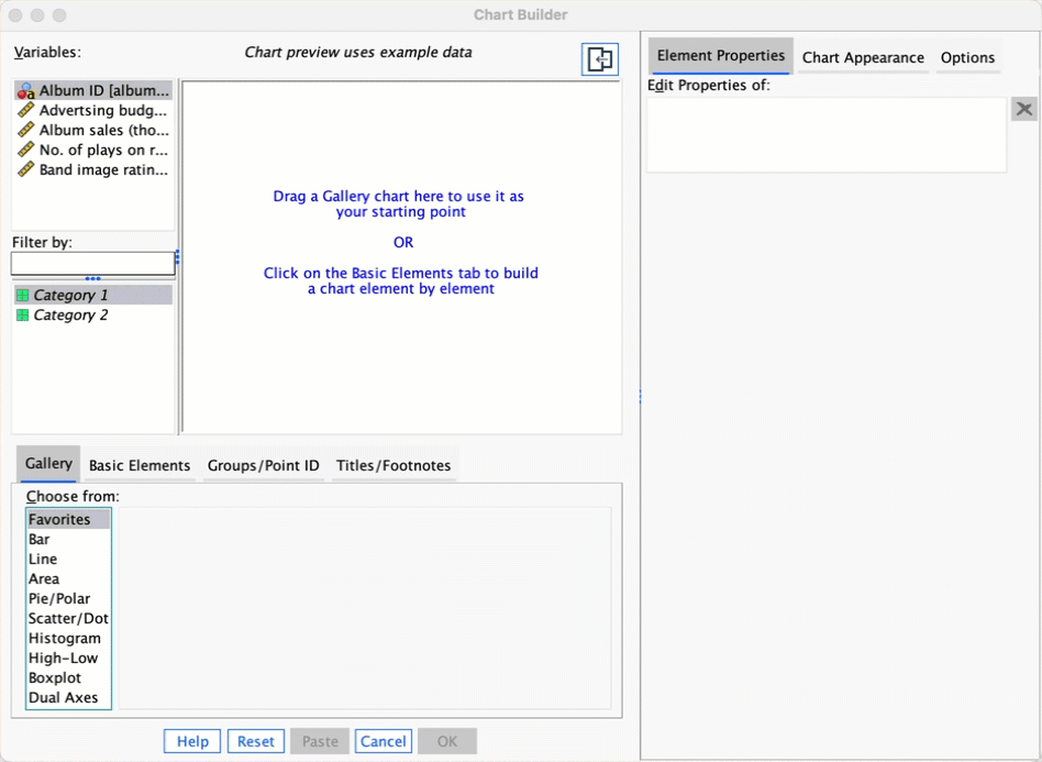
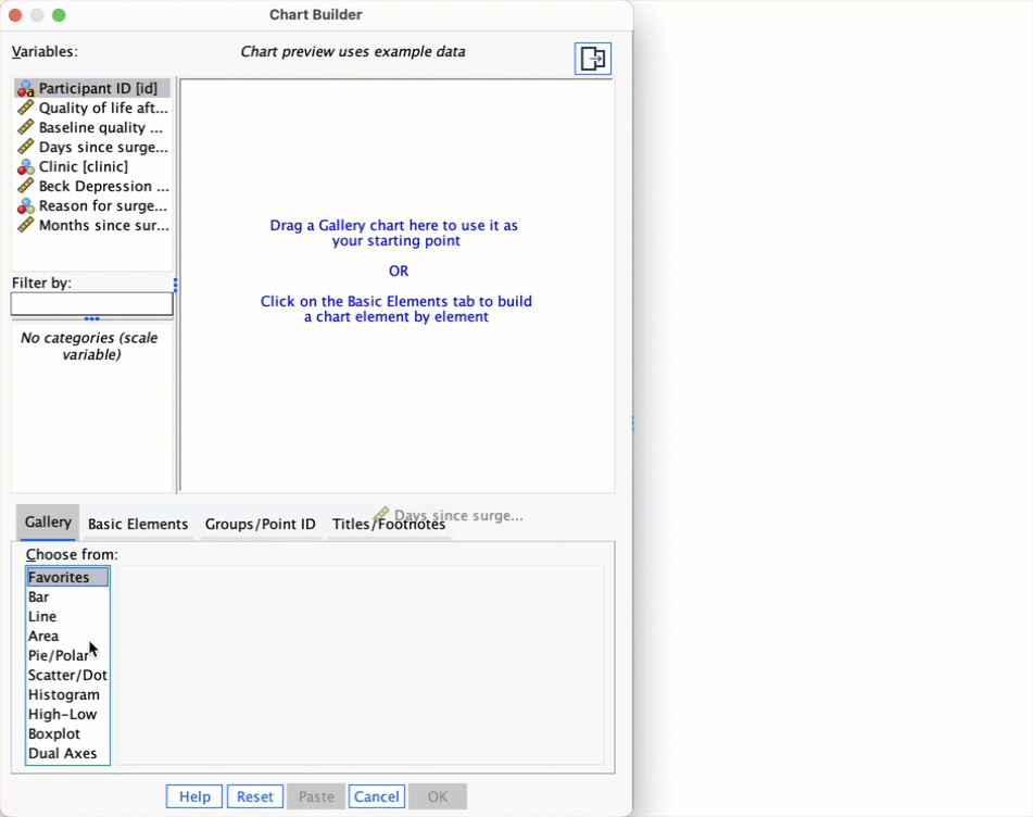
First, access the Chart Builder and then select Histogram in the list labelled Choose from: to bring up the gallery. This gallery has four icons representing different types of histogram, and you should select the appropriate one either by double-clicking on it, or by dragging it onto the canvas. We are going to do a simple histogram first, so double-click the icon for a simple histogram. The dialog box will show a preview of the plot in the canvas area. Next, drag the variable (success_pre) to  . You will now find the histogram previewed on the canvas. To produce the histogram click .
The resulting histogram is shown below. Looking at the histogram, the data look fairly symmetrical and there doesn’t seem to be any sign of skew.
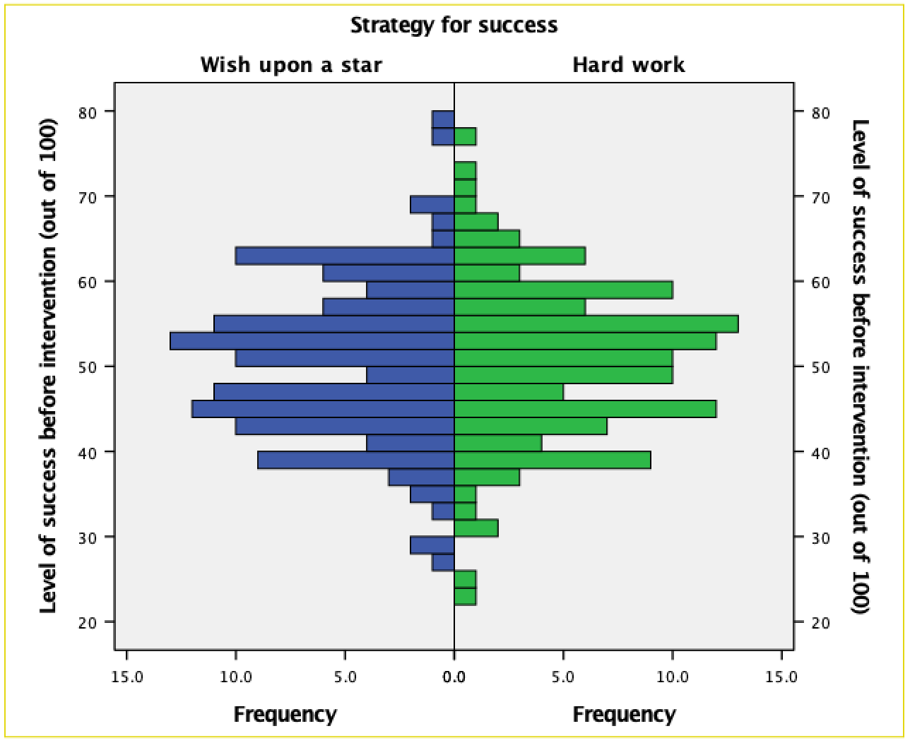
To compare frequency distributions of several groups simultaneously we can use a population pyramid. click the population pyramid icon (see the book chapter) to display the template for this plot on the canvas. Then from the variable list select the variable representing the success scores before the intervention and drag it into the Distribution Variable? drop zone. Then drag the variable strategy to  . click to produce the plot.
The resulting population pyramid is show below and looks fairly symmetrical. This indicates that both groups had a similar spread of scores before the intervention. Hopefully, this example shows how a population pyramid can be a very good way to visualise differences in distributions in different groups (or populations).
Self-test 5.3
Produce boxplots for the success scores before the intervention.
To make a boxplot of the pre-intervention success scores for our two groups, double-click the simple boxplot icon, then from the variable list select the success_pre variable and drag it into  and select the variable
 strategy and drag it to . Note that the variable names are displayed in the drop zones, and the canvas now displays a preview of our plot (e.g. there are two boxplots representing each gender). click to produce the plot.
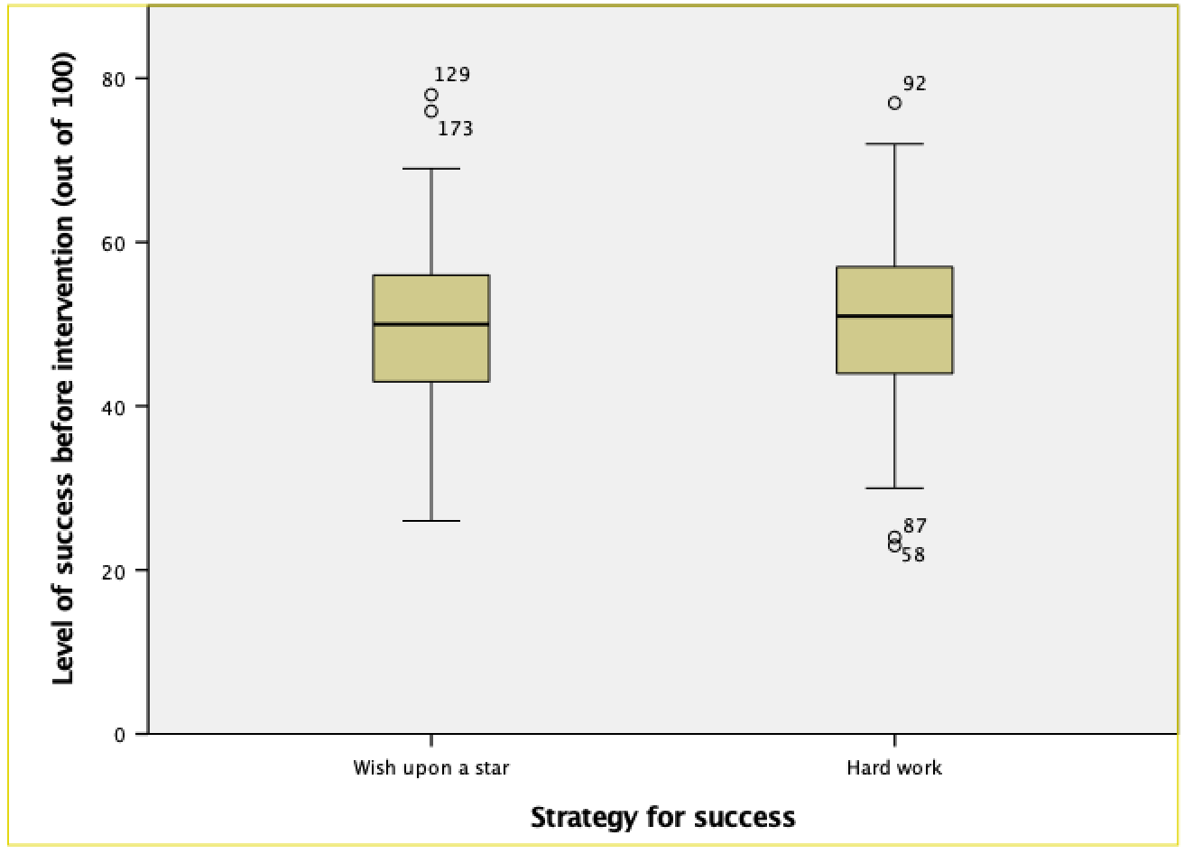
Looking at the resulting boxplots above, notice that there is a tinted box, which represents the IQR (i.e., the middle 50% of scores). It’s clear that the middle 50% of scores are more or less the same for both groups. Within the boxes, there is a thick horizontal line, which shows the median. The workers had a very slightly higher median than the wishers, indicating marginally greater pre-intervention success but only marginally.
In terms of the success scores, we can see that the range of scores was very similar for both the workers and the wishers, but the workers contained slightly higher levels of success than the wishers. Like histograms, boxplots also tell us whether the distribution is symmetrical or skewed. If the whiskers are the same length then the distribution is symmetrical (the range of the top and bottom 25% of scores is the same); however, if the top or bottom whisker is much longer than the opposite whisker then the distribution is asymmetrical (the range of the top and bottom 25% of scores is different). The scores from both groups look symmetrical because the two whiskers are similar lengths in both groups.
Self-test 5.4
Use what you learnt in Section 5.6.3 to add error bars to this plot and to label both the x- (I suggest ‘Time’) and y-axis (I suggest ‘Mean grammar score (%)’).
See Figure 5.26 in the book.
Self-test 5.5
The procedure for producing line charts is basically the same as for bar charts. Follow the previous sections for bar charts but selecting a simple line chart instead of a simple bar chart, and a multiple line chart instead of a clustered bar chart. Produce line charts equivalents of each of the bar charts in the previous section. If you get stuck, the self-test answers on the companion website will walk you through it.
Simple Line Charts for Independent Means
Let’s use the data in notebook.sav (see book for details). Load this file now. Let’s plot the mean rating of the two films. We have one grouping variable (the film) and one outcome (the arousal); therefore, we want a simple line chart. Therefore, in the Chart Builder double-click the icon for a simple line chart. On the canvas you will see a plot and two drop zones: one for the y-axis and one for the x-axis. The y-axis needs to be the dependent variable, or the thing you’ve measured, or more simply the thing for which you want to display the mean. In this case it would be arousal, so select arousal from the variable list and drag it into . The x-axis should be the variable by which we want to split the arousal data. To plot the means for the two films, select the variable film from the variable list and drag it into .
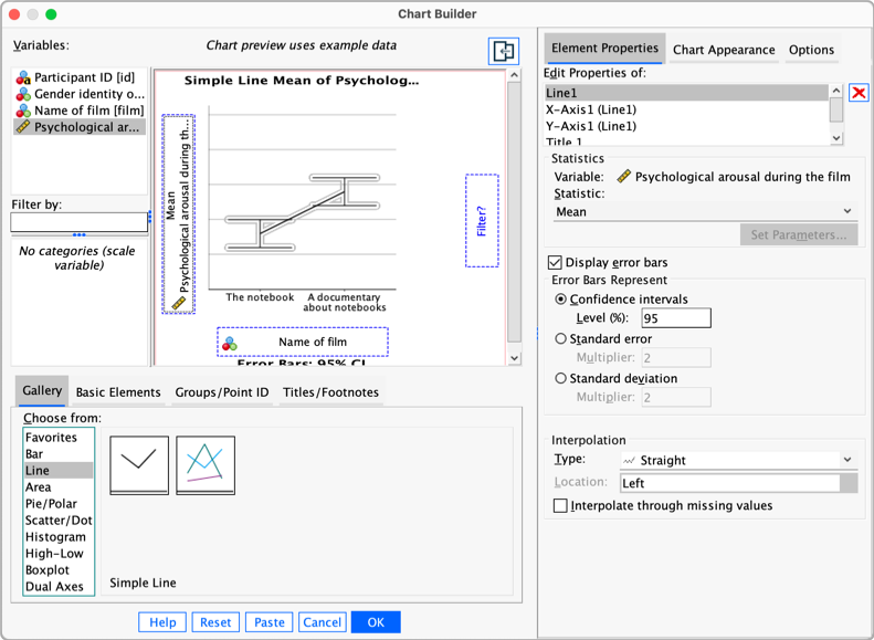
The figure above shows some other options for the line chart. We can add error bars to our line chart by selecting  . Normally, error bars show the 95% confidence interval, and I have selected this option (
 ). Click
  , then to produce the plot.
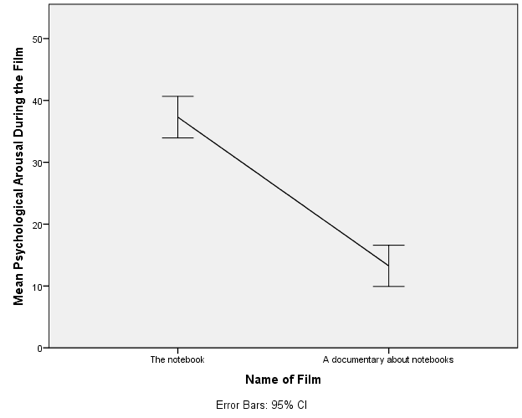
The resulting line chart displays the means (and the confidence interval of those means). This plot shows us that, on average, people were more aroused by The notebook than a documentary about notebooks.
Multiple line charts for independent means
To do a multiple line chart for means that are independent (i.e., have come from different groups) we need to double-click the multiple line chart icon in the Chart Builder (see the book chapter). On the canvas you will see a plot as with the simple line chart but there is now an extra drop zone:  . All we need to do is to drag our second grouping variable into this drop zone.
As with the previous example, drag arousal into , then drag film into . Now drag gender_identity into . This will mean that lines representing those identifying as males and females will be displayed in different colours. As in the previous section, select error bars in the properties dialog box and click to apply them, click to produce the plot.
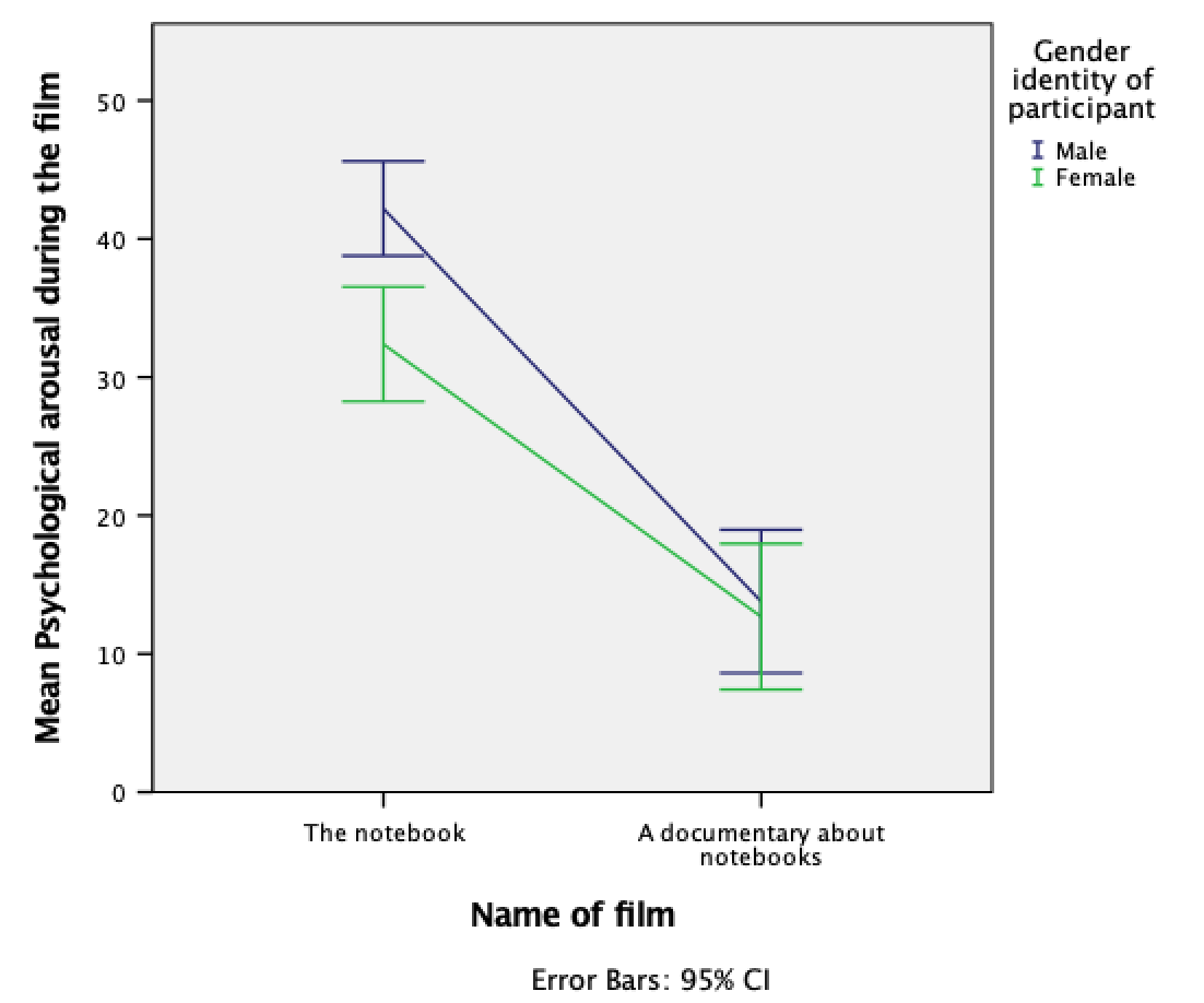
The mean arousal for the notebook shows that males were more aroused during this film than females. This indicates they enjoyed the film more than the women did. Contrast this with the documentary, for which arousal levels are comparable in males and females.
Simple line charts for related means
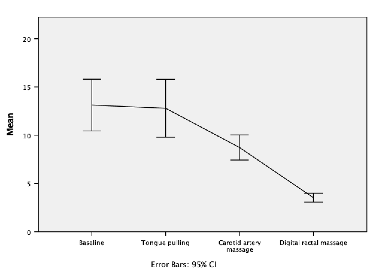
Load the file hiccups.sav (see book for details). To plot the mean number of hiccups as a line, go to the Chart Builder and double-click the icon for a simple line chart. For these data we have four columns containing data on the number of hiccups (the outcome variable). We need to drag all four of these variables from the variable list into the y-axis drop zone simultaneously. If you don’t know how to do this then, follow the instructions in the book for the bar chart of these data. You can set all of the properties of the axes, and add error bars in the same way as for a bar chart, so look at Figures 5.24 and 5.25 in the book and follow the accompanying instructions. The final dialog box will look like the Figure below.

The resulting line chart displays the mean (and the confidence interval of the mean) number of hiccups at baseline and after the three interventions. Note that the axis labels that we typed in have appeared on the plot. We can conclude that the amount of hiccups after tongue pulling was about the same as at baseline; however, carotid artery massage reduced hiccups, but not by as much as a good old-fashioned digital rectal massage. The moral here is: if you have hiccups, find something digital and go amuse yourself for a few minutes.
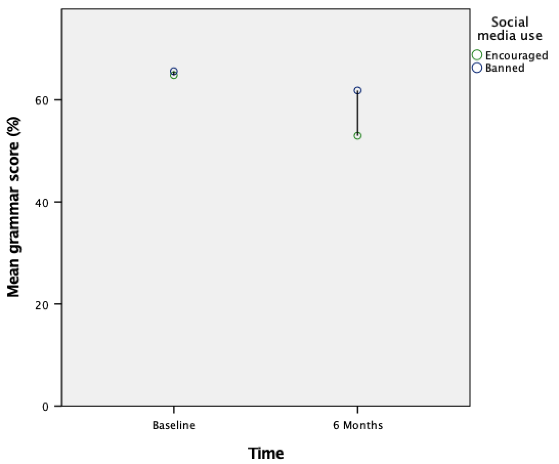
Multiple line charts for mixed designs
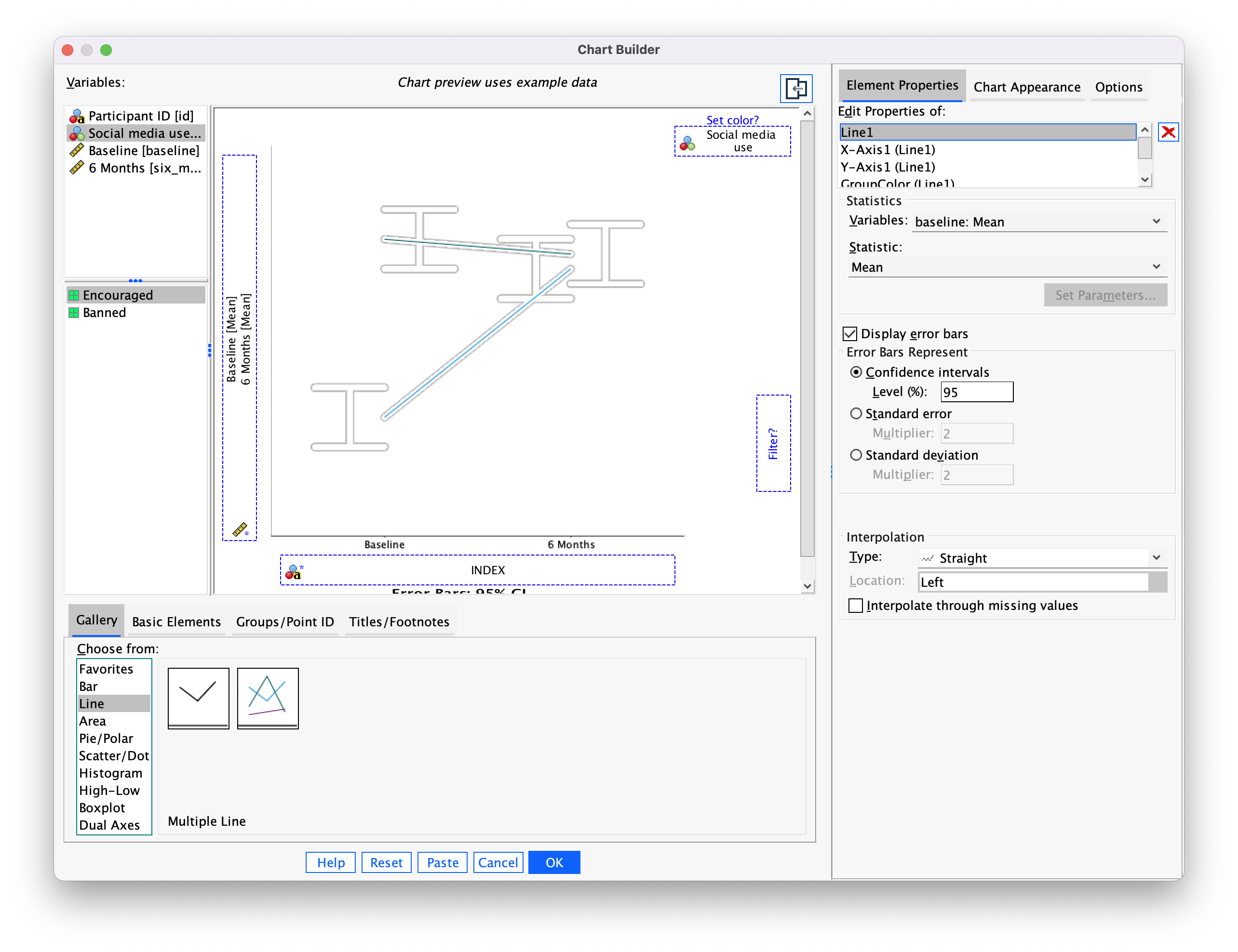
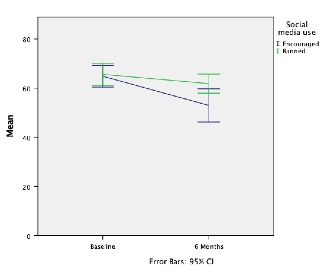
To do the line plot equivalent of the bar chart we did for the social_media.sav data (see book for details) we follow the same procedure that we used to produce a bar chart of these described in the book, except that we begin the whole process by selecting a multiple line chart in the Chart Builder. Once this selection is made, everything else is the same as in the book.
The resulting line chart shows that that at baseline (before the intervention) the grammar scores were comparable in our two groups; however, after the intervention, the grammar scores were lower in those encouraged to use social media than those banned from using it. If you compare the lines you can see that social media users’ grammar scores have fallen over the six months; compare this to the controls whose grammar scores are similar over time. We might, therefore, conclude that social media use has a detrimental effect on people’s understanding of English grammar.
Self-test 5.6
Doing a simple dot plot in the Chart Builder is quite similar to drawing a histogram. Reload the
jiminy_cricket.savdata and see if you can produce a simple dot plot of the success scores after the intervention. Compare the resulting plot to the earlier histogram of the same data (Figure 5.11). Remember that your starting point is to double-click the icon for a simple dot plot in the Chart Builder (Figure 5.32), then use the instructions for plotting a histogram (Section 5.4) – there is guidance on the companion website.
First, make sure that you have loaded the jiminy_cricket.sav file and that you open the Chart Builder from this data file. Once you have accessed the Chart Builder (see the book chapter) select the Scatter/Dot in the chart gallery and then double-click the icon for a simple dot plot (again, see the book chapter if you’re unsure of what icon to click).
Like a histogram, a simple dot plot plots a single variable (x-axis) against the frequency of scores (y-axis).To do a simple dot plot of the success scores after the intervention we drag this variable to as shown in the figure. click .

The resulting density plot is shown below. Compare this with the histogram of the same data from the book. The first thing that should leap out at you is that they are very similar; they are two ways of showing the same thing. The density plot gives us a little more detail than the histogram, but essentially they show the same thing.
Self-test 5.7
Doing a drop-line plot in the Chart Builder is quite similar to drawing a clustered bar chart. Reload the
notebook.savdata and see if you can produce a drop-line plot of the arousal scores. Compare the resulting plot to the earlier clustered bar chart of the same data (Figure 5.21). The instructions in Section 5.6.2 should help.
To do a drop-line chart for means that are independent double-click the drop-line chart icon in the Chart Builder (see the book chapter if you’re not sure what this icon looks like or how to access the Chart Builder). As with the clustered bar chart example from the book, drag arousal from the variable list into , drag Film from the variable list into , and drag gender_identity into the drop zone.
This will mean that the dots representing those identifying as males and females will be displayed in different colours, but if you want them displayed as different symbols then read SPSS Tip 5.3 in the book. The completed dialog box is shown in the figure; click to produce the plot.
The resulting drop-line plot is shown below: compare it with the clustered bar chart from the book. Hopefully it’s clear that these plots show the same information and can be interpretted in the same way (see the book).

Now see if you can produce a drop-line plot of the
social_media.savdata from earlier in this chapter. Compare the resulting plot to the earlier clustered bar chart of the same data (Figure 5.30). The instructions in Section 5.6.5 should help.
Double-click the drop-line chart icon in the Chart Builder (see the book chapter if you’re not sure what this icon looks like or how to access the Chart Builder). We have a repeated-measures variable is time (whether grammatical ability was measured at baseline or six months) and is represented in the data file by two columns, one for the baseline data and the other for the follow-up data. In the Chart Builder select these two variables simultaneously and drag them into as shown in the figure. (See the book for details of how to do this, if you need them.) The second variable (whether people were encouraged to use social media or were banned) was measured using different participants and is represented in the data file by a grouping variable (Social media use). Drag this variable from the variable list into . The completed Chart Builder is shown in the figure; click to produce the plot.
The resulting drop-line plot is shown below. Compare this figure with the clustered bar chart of the same data from the book. They both show that at baseline (before the intervention) the grammar scores were comparable in our two groups. On the drop-line plot this is particularly apparent because the two dots merge into one (you can’t see the drop line because the means are so similar). After the intervention, in those encouraged to use social media than those banned from using it. By comparing the two vertical lines the drop-line plot makes clear that the difference between those encouraged to use social media than those banned is bigger at 6 months than it is pre-intervention.
Chapter 6
Self-test 6.1
Compute the mean and sum of squared error for the new data set.
First we need to compute the mean:
\[ \begin{aligned} \overline{X} &= \frac{\sum_{i=1}^{n} x_i}{n} \\ \ &= \frac{1+3+10+3+2}{5} \\ \ &= \frac{19}{5} \\ \ &= 3.8 \end{aligned} \]
Compute the squared errors as follows:
| Score | Error (score - mean) | Error squared |
|---|---|---|
| 1 | -2.8 | 7.84 |
| 3 | -0.8 | 0.64 |
| 10 | 6.2 | 38.44 |
| 3 | -0.8 | 0.64 |
| 2 | -1.8 | 3.24 |
The sum of squared errors is:
\[ \begin{aligned} \ SS &= 7.84 + 0.64 + 38.44 + 0.64 + 3.24 \\ \ &= 50.8 \\ \end{aligned} \]
Self-test 6.2
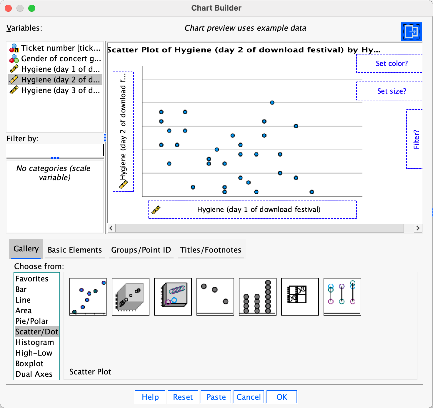
Using what you learnt in Chapter 5 plot a scatterplot of the day 2 scores against the day 1 scores.
First, access the Chart Builder and select Scatter/Dot in the list labelled Choose from:. We are going to do a simple scatterplot, so double-click the icon for a Scatter plot. The dialog box will now show a preview of the plot in the canvas area. Drag the hygiene day 1 variable to and the hygiene day 2 variable to as shown below; you will now find the plot previewed on the canvas.Click to produce the plot (which is reproduced in the book).
Self-test 6.3
Now we have removed the outlier in the data, re-plot the scatterplot and repeat the explore command from Section 6.9.2.
Repeat the instructions for self-test 6.2.
Self-test 6.4
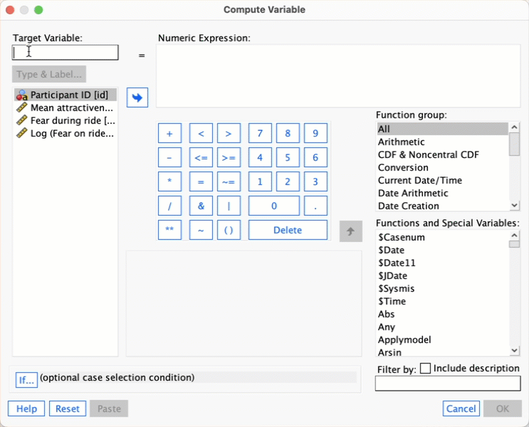
Follow the main text to try to create a variable that is the natural log of the fear scores. Name this variable
log_fear.
Follow the instructions in the book. Here’s a screencast to help:
Self-test 6.5
Follow the main text to try to create a variable that is the square root of the fear scores. Name this variable
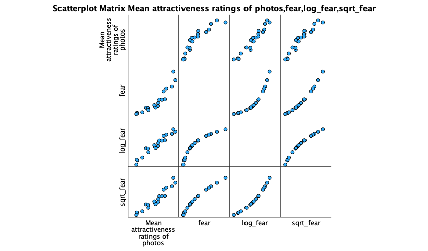
sqrt_fear. Produce a matrix scatterplot of attractiveness against the raw scores and the two transformed versions of fear.
Follow the instructions in the book to create sqrt_fear. Here’s a screencast to help:
Then produce the scatterplot matrix as in the screen cast. Remember that you can select multiple variables by holding down the Ctrl key (Cmd on a Mac), and you can then drag them all onto the canvas simultaneously (on a Mac you need to keep Cmd held down as you drag).

The resulting scatterplot is below. Look at the top row. These plots show the mean attractiveness ratings on the vertical y-axis, against different versions of the fear variable. Note that the raw fear scores have a curvilinear relationship with attractiveness ratings because the pattern of dots has a noticeable bend (first scatterplot in the top row). However, for log fear scores (second scatterplot in the top row) and square root fear scores (final scatterplot in the top row) the relationship is linear (the pattern of dots follows a straight line). These patterns suggest that the long and square root transformations have improved the linearity of the relationship between fear and attractiveness ratings.
Self-test 6.6
Compute the mean and variance of the attractiveness ratings. Now compute them for the 5%, 10% and 20% trimmed data.
Mean and variance
Compute the squared errors as follows:
| Score | Error (score - mean) | Error squared |
|---|---|---|
| 0 | -6 | 36 |
| 0 | -6 | 36 |
| 3 | -3 | 9 |
| 4 | -2 | 4 |
| 4 | -2 | 4 |
| 5 | -1 | 1 |
| 5 | -1 | 1 |
| 6 | 0 | 0 |
| 6 | 0 | 0 |
| 6 | 0 | 0 |
| 6 | 0 | 0 |
| 7 | 1 | 1 |
| 7 | 1 | 1 |
| 7 | 1 | 1 |
| 8 | 2 | 4 |
| 8 | 2 | 4 |
| 9 | 3 | 9 |
| 9 | 3 | 9 |
| 10 | 4 | 16 |
| 10 | 4 | 16 |
| 120 | NA | 152 |
To calculate the mean of the attractiveness ratings we use the equation (and the sum of the first column in the table):
\[ \begin{aligned} \overline{X} &= \frac{\sum_{i=1}^{n} x_i}{n} \\ \ &= \frac{120}{20} \\ \ &= 6 \end{aligned} \]
To calculate the variance we use the sum of squares (the sum of the values in the final column of the table) and this equation:
\[ \begin{aligned} \ s^2 &= \frac{\text{sum of squares}}{n-1} \\ \ &= \frac{152}{19} \\ \ &= 8 \end{aligned} \]
5% trimmed mean and variance
Next, let’s calculate the mean and variance for the 5% trimmed data. We basically do the same thing as before but delete 1 score at each extreme (there are 20 scores and 5% of 20 is 1).
Compute the squared errors as follows:
| Score | Error (score - mean) | Error squared |
|---|---|---|
| 0 | -6.11 | 37.33 |
| 3 | -3.11 | 9.67 |
| 4 | -2.11 | 4.45 |
| 4 | -2.11 | 4.45 |
| 5 | -1.11 | 1.23 |
| 5 | -1.11 | 1.23 |
| 6 | -0.11 | 0.01 |
| 6 | -0.11 | 0.01 |
| 6 | -0.11 | 0.01 |
| 6 | -0.11 | 0.01 |
| 7 | 0.89 | 0.79 |
| 7 | 0.89 | 0.79 |
| 7 | 0.89 | 0.79 |
| 8 | 1.89 | 3.57 |
| 8 | 1.89 | 3.57 |
| 9 | 2.89 | 8.35 |
| 9 | 2.89 | 8.35 |
| 10 | 3.89 | 15.13 |
| 110 | NA | 99.74 |
To calculate the mean of the attractiveness ratings we use the equation (and the sum of the first column in the table):
\[ \begin{aligned} \overline{X} &= \frac{\sum_{i=1}^{n} x_i}{n} \\ \ &= \frac{110}{18} \\ \ &= 6.11 \end{aligned} \]
To calculate the variance we use the sum of squares (the sum of the values in the final column of the table) and this equation:
\[ \begin{aligned} \ s^2 &= \frac{\text{sum of squares}}{n-1} \\ \ &= \frac{99.74}{17} \\ \ &= 5.87 \\ \end{aligned} \]
10% trimmed mean and variance
Next, let’s calculate the mean and variance for the 10% trimmed data. To do this we need to delete 2 scores from each extreme of the original data set (there are 20 scores and 10% of 20 is 2).
Compute the squared errors as follows:
| Score | Error (score - mean) | Error squared |
|---|---|---|
| 3 | -3.25 | 10.56 |
| 4 | -2.25 | 5.06 |
| 4 | -2.25 | 5.06 |
| 5 | -1.25 | 1.56 |
| 5 | -1.25 | 1.56 |
| 6 | -0.25 | 0.06 |
| 6 | -0.25 | 0.06 |
| 6 | -0.25 | 0.06 |
| 6 | -0.25 | 0.06 |
| 7 | 0.75 | 0.56 |
| 7 | 0.75 | 0.56 |
| 7 | 0.75 | 0.56 |
| 8 | 1.75 | 3.06 |
| 8 | 1.75 | 3.06 |
| 9 | 2.75 | 7.56 |
| 9 | 2.75 | 7.56 |
| 100 | NA | 46.96 |
To calculate the mean of the attractiveness ratings we use the equation (and the sum of the first column in the table):
\[ \begin{aligned} \overline{X} &= \frac{\sum_{i=1}^{n} x_i}{n} \\ \ &= \frac{100}{16} \\ \ &= 6.25 \end{aligned} \]
To calculate the variance we use the sum of squares (the sum of the values in the final column of the table) and this equation:
\[ \begin{aligned} \ s^2 &= \frac{\text{sum of squares}}{n-1} \\ \ &= \frac{46.96}{15} \\ \ &= 3.13 \\ \end{aligned} \]
20% trimmed mean and variance
Finally, let’s calculate the mean and variance for the 20% trimmed data. To do this we need to delete 4 scores from each extreme of the original data set (there are 20 scores and 20% of 20 is 4).
Compute the squared errors as follows:
| Score | Error (score - mean) | Error squared |
|---|---|---|
| 4 | -2.25 | 5.06 |
| 5 | -1.25 | 1.56 |
| 5 | -1.25 | 1.56 |
| 6 | -0.25 | 0.06 |
| 6 | -0.25 | 0.06 |
| 6 | -0.25 | 0.06 |
| 6 | -0.25 | 0.06 |
| 7 | 0.75 | 0.56 |
| 7 | 0.75 | 0.56 |
| 7 | 0.75 | 0.56 |
| 8 | 1.75 | 3.06 |
| 8 | 1.75 | 3.06 |
| 75 | NA | 16.22 |
To calculate the mean of the attractiveness ratings we use the equation (and the sum of the first column in the table):
\[ \begin{aligned} \overline{X} &= \frac{\sum_{i=1}^{n} x_i}{n} \\ \ &= \frac{75}{12} \\ \ &= 6.25 \end{aligned} \]
To calculate the variance we use the sum of squares (the sum of the values in the final column of the table) and this equation:
\[ \begin{aligned} \ s^2 &= \frac{\text{sum of squares}}{n-1} \\ \ &= \frac{16.22}{11} \\ \ &= 1.47 \\ \end{aligned} \]
Chapter 7
Self-test 7.1
What are the null hypotheses for these hypotheses?
- There is no difference in depression levels between those who drank alcohol and those who took ecstasy on Sunday.
- There is no difference in depression levels between those who drank alcohol and those who took ecstasy on Wednesday.
Self-test 7.2
Based on what you have just learnt, try ranking the Sunday data.
The answers are in Figure 7.4. There are lots of tied ranks and the data are generally horrible.
Self-test 7.3
See whether you can use what you have learnt about data entry to enter the data in Table 7.1 into SPSS.
The solution is in the chapter (and see the file drug.sav).
Self-test 7.4
Use SPSS to test for normality and homogeneity of variance in these data.
To get the outputs in the book use the following dialog boxes:
Self-test 7.5
Have a go at ranking the data and see if you get the same results as me.
Solution is in the book chapter (Table 7.3).
Self-test 7.6
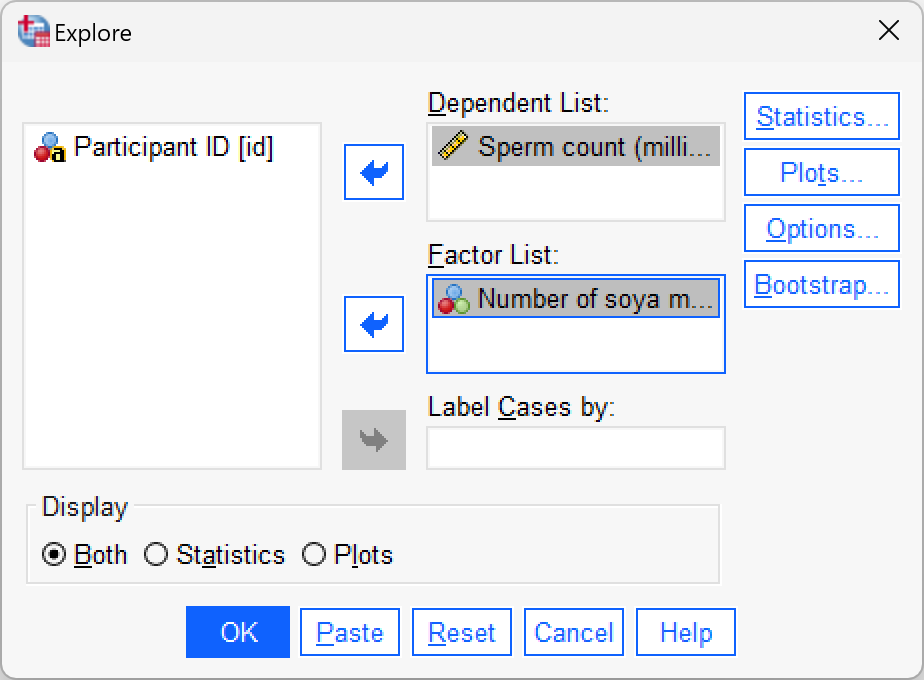
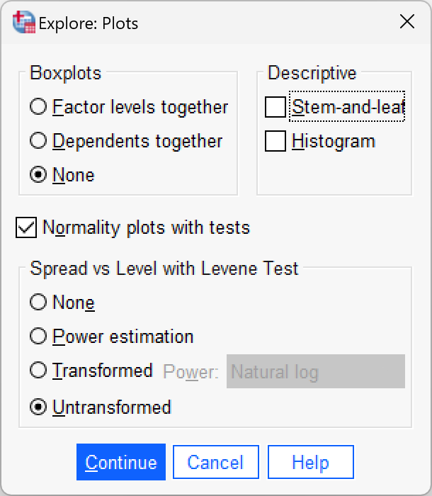
See whether you can enter the data in Table 7.3 into SPSS (you don’t need to enter the ranks). Then conduct some exploratory analyses on the data (see Sections 6.9.4 and 6.9.6).
Data entry is explained in the book (and see soya.sav. To get the outputs in the book use the following dialog boxes:
Self-test 7.7
Have a go at ranking the data and see if you get the same results as in Table 7.5.
Solution is in the book chapter.
Self-test 7.8
Using what you know about inputting data, enter these data into SPSS and run exploratory analyses.
Data entry is explained in the book. To get the outputs in the book use the following dialog boxes:
Chapter 8
Self-test 8.1
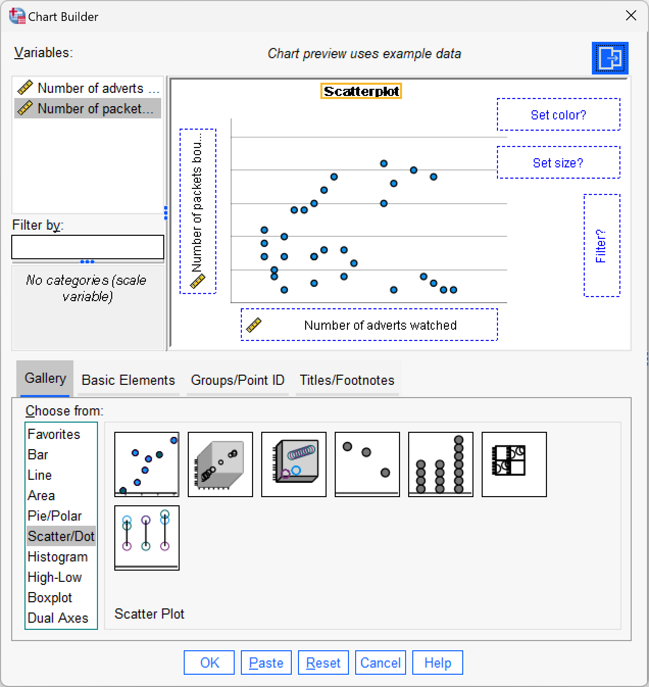
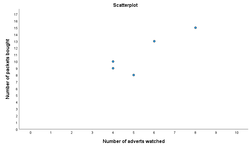
Enter the advert data and use the chart editor to produce a scatterplot (number of packets bought on the y-axis, and adverts watched on the x-axis) of the data.
The finished Chart Builder should look like this:
My scatterplot came out like this:
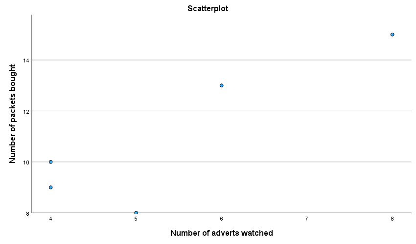
This plot looks daft because SPSS has not scaled the axes from 0. If yours looks like this too, then, as an additional task, edit it so that the axes both start at 0. While you’re at it, why not make it look Tufte style. Mine ended up like this:
Self-test 8.2
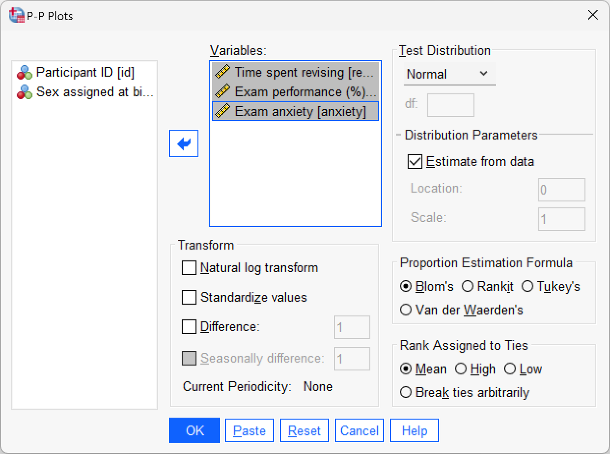
Create P-P plots of the variables
revise,exam, andanxiety.
To get a P-P plot use Analyze > Descriptive Statistics > P-P Plots… to access the dialog box below. There’s not a lot to say about this dialog box really because the default options will compare any variables selected to a normal distribution, which is what we want (although note that there is a drop-down list of different distributions against which you could compare your data). Drag the three variables revise, exam and anxiety from the variable list to the box labelled Variables. Click to draw the plots. The plots are interpretted in the book.
Self-test 8.3
Conduct a Pearson correlation analysis of the advert data from the beginning of the chapter.
Select Analyze > Correlate > Bivariate to get this dialog box:
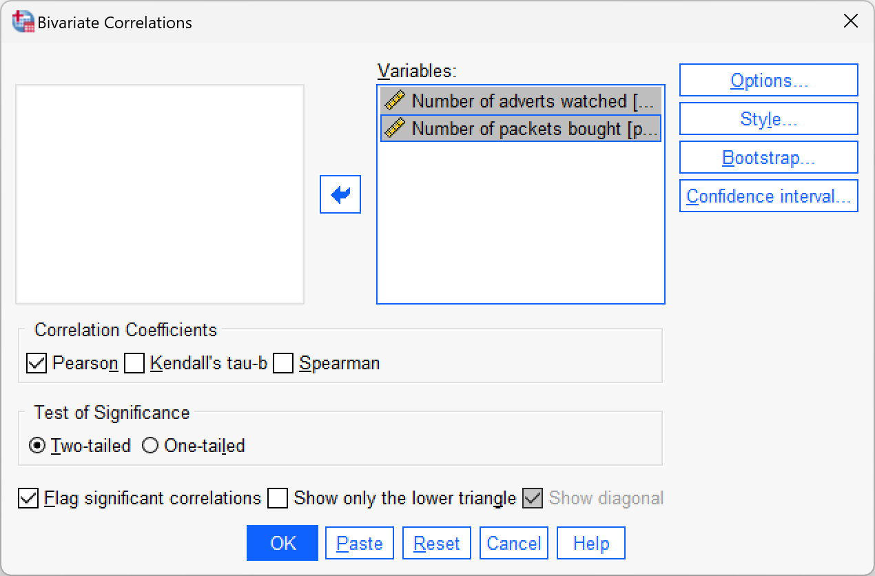
Drag adverts and packets to the variables list (or click ![]() ). Click to run the analysis. The output is shown in the book chapter.
). Click to run the analysis. The output is shown in the book chapter.
Self-test 8.4
Using the
roaming_cats.savfile, compute a Pearson correlation betweensexandtime.
Select Analyze > Correlate > Bivariate to get this dialog box:
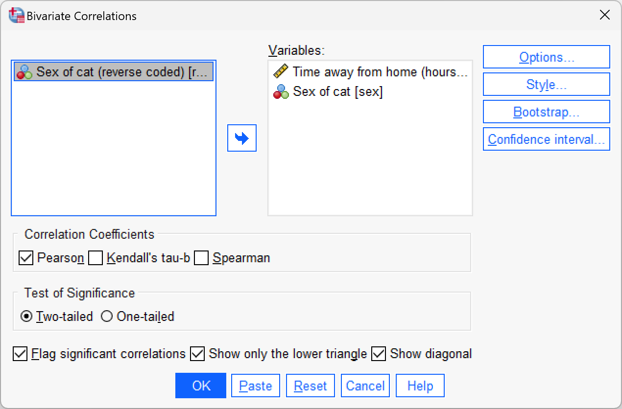
Drag time and sex to the variables list (or click ![]() ). click
). click  to get some robust confidence intervals and select these options:
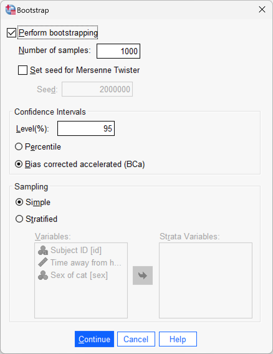
Click  to return to the main dialog box and to run the analysis. The output is shown in the book chapter.
Self-test 8.5
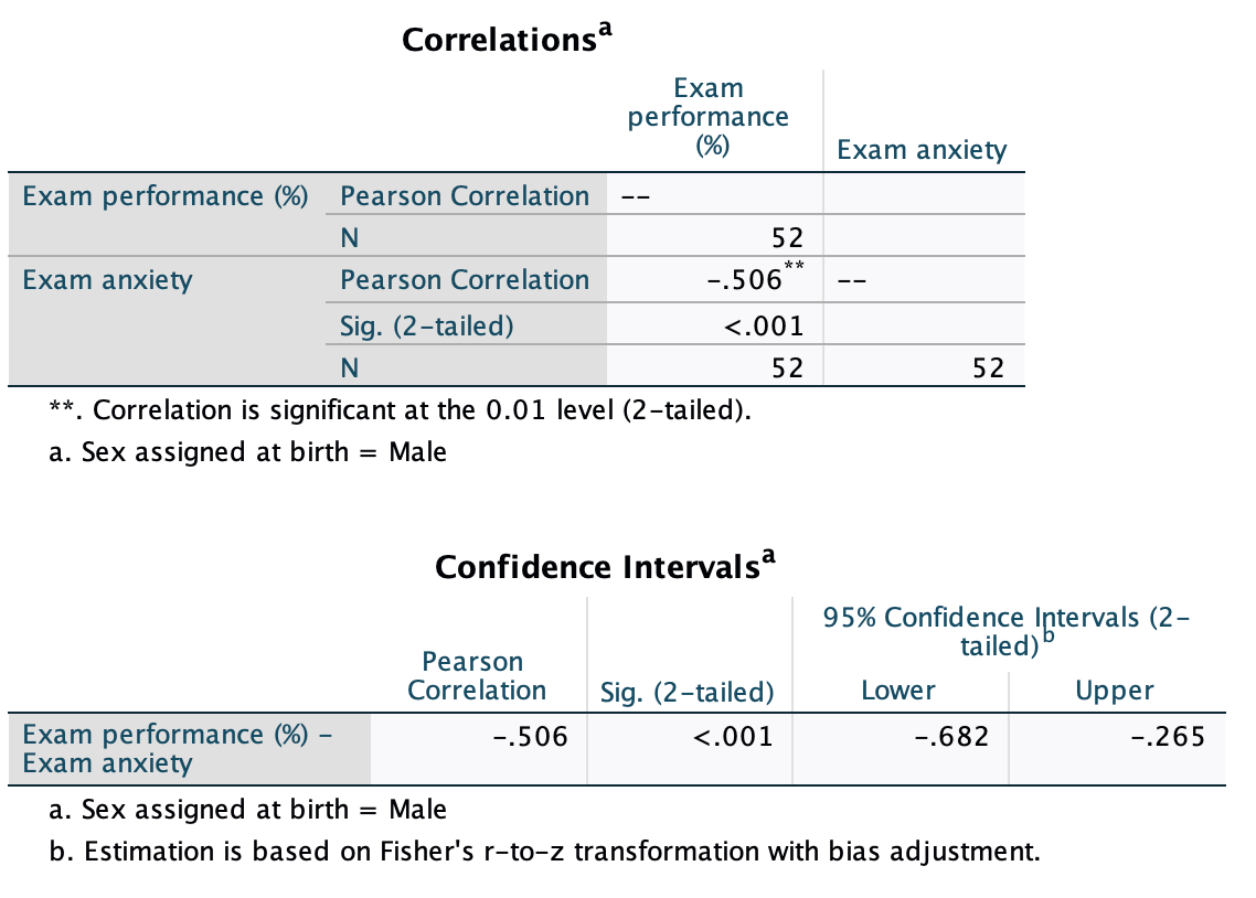
Use the split file command to compute the correlation coefficient between exam anxiety and exam performance in men and women.
To split the file, select Data > Split File … . In the resulting dialog box select the option Organize output by groups. Drag the variable Sex to the Groups Based on box (or click ![]() ). The completed dialog box should look like this:
). The completed dialog box should look like this:

To get the correlation coefficients select Analyze > Correlate > Bivariate to get the main dialog box. Drag the variables exam and anxiety to the variables list (or click ![]() ). Click to run the analysis. The completed dialog box will look like this:
). Click to run the analysis. The completed dialog box will look like this:

The output for males will look like this:
For females, the output is as follows:
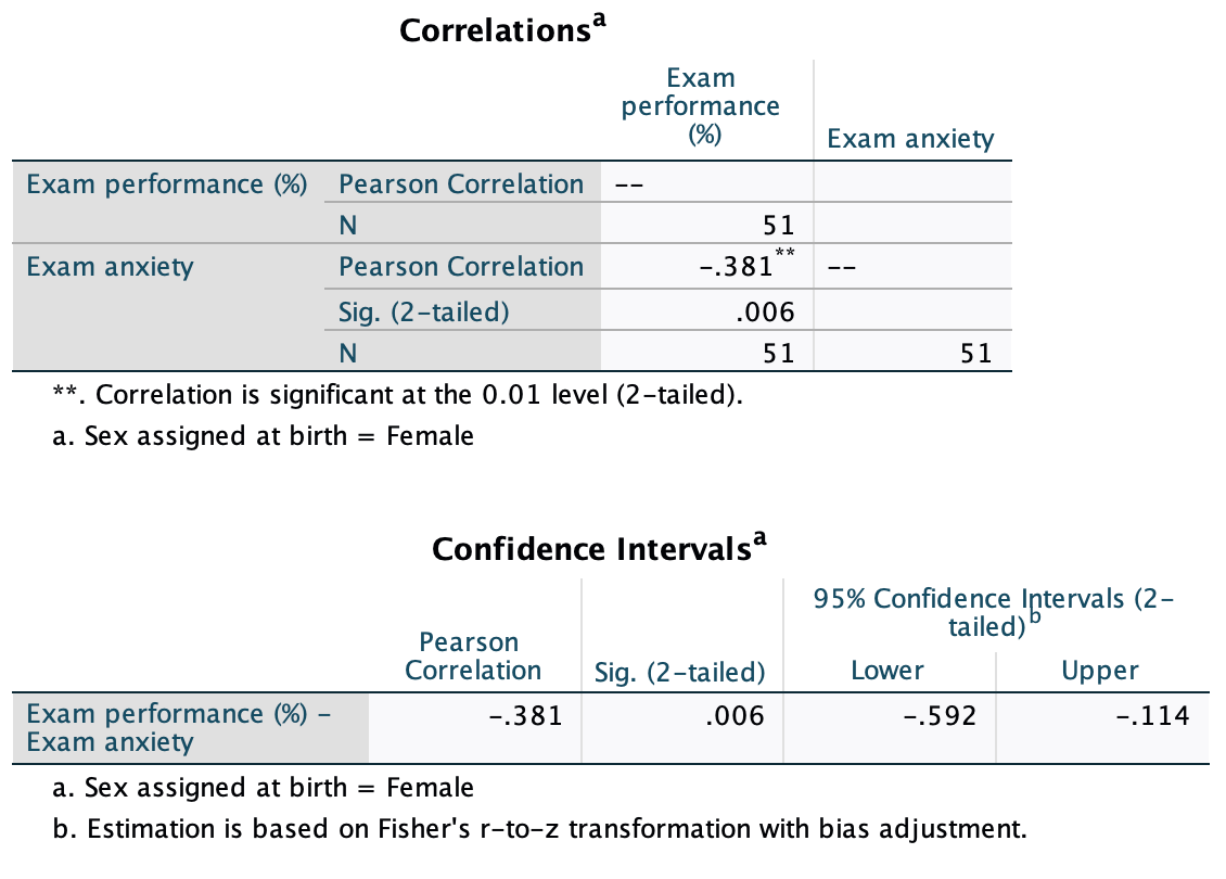
The book chapter has some interpretation of these findings and suggestions for how to compare the coefficients for males and females.
Chapter 9
Self-test 9.1
Produce a scatterplot of sales (y-axis) against advertising budget (x-axis). Include the regression line.
Create the scatterplot as follows:
 ## Self-test 9.2
If a predictor had ‘no effect’, how would the outcome change as the predictor changes? What would be the corresponding value of b? What, therefore, would be a reasonable null hypothesis?
Answered in the book:
Under the null hypothesis that there is ‘no relationship’ or ‘no effect’ between a predictor and an outcome, then as the predictor changes we would expect the predicted value of the outcome to not change (it is a constant value). In other words, the regression line would be flat. Therefore, ‘no effect’ equates to ‘flat line’ and ‘flat line’ equates to b = 0. If we want a hypothesis test then we can compare the ‘alternative hypothesis’ that there is an effect against this null. When there is an effect, the model will not be flat and b will not equal zero. So, we get the following hypotheses - \(H_0: b = 0\). If there is no association between a predictor and outcome variable we’d expect the parameter for that predictor to be zero. - \(H_1: b \ne 0\). If there is a non-zero association between a predictor and outcome variable we’d expect the parameter for that predictor to be non-zero.
Self-test 9.3
Once you have read Section 9.7, fit a linear model first with all the cases included and then with case 30 deleted.
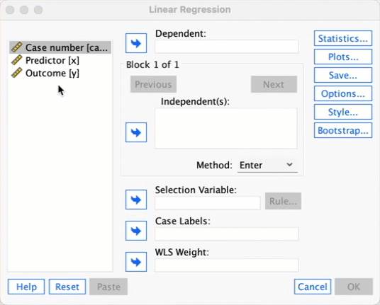
To run the analysis on all 30 cases, you need to access the main dialog box by selecting Analyze > Regression > Linear …. The figure below shows the resulting dialog box. There is a space labelled Dependent in which you should place the outcome variable (in this example y). There is another space labelled Independent(s) in which any predictor variable should be placed (in this example, x). click  and tick Unstandardized under Predicted values (see figure below), and then click to return to the main dialog box and to run the analysis.
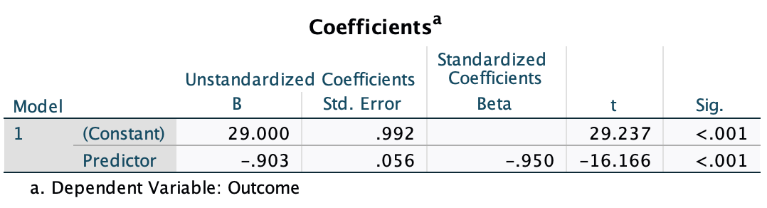
After running the analysis you should get the output below. (See the book chapter for an explanation of these results.)
To run the analysis with case 30 deleted, go to Data > Select Cases to open the dialog box in the figure below. Once this dialog box is open select Based on time or case range and then click Range. We want to set the range to be from case 1 to case 29, so type these numbers in the relevant boxes (see figure below). Click to return to the main dialog box and to filter the cases.

Once you have done this, your data should look like mine below. You will see that case 30 now has a diagonal strike through it to indicate that this case will be excluded from any further analyses.

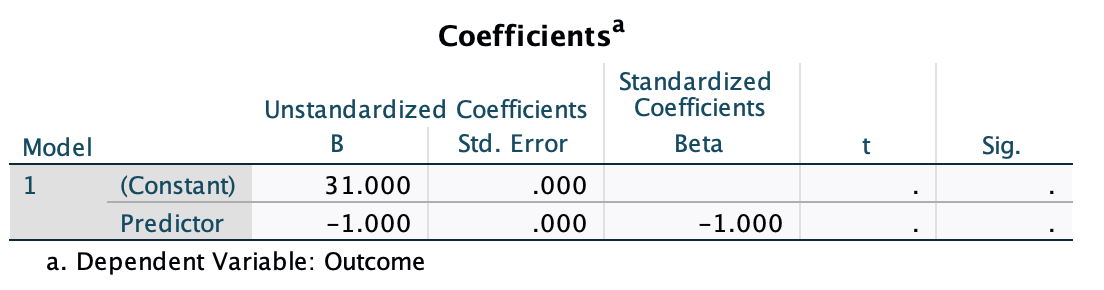
Now we can run the regression in the same way as we did before by selecting Analyze > Regression > Linear … (see screencast above). You should get the same output as mine below (see the book chapter for an explanation of the results).
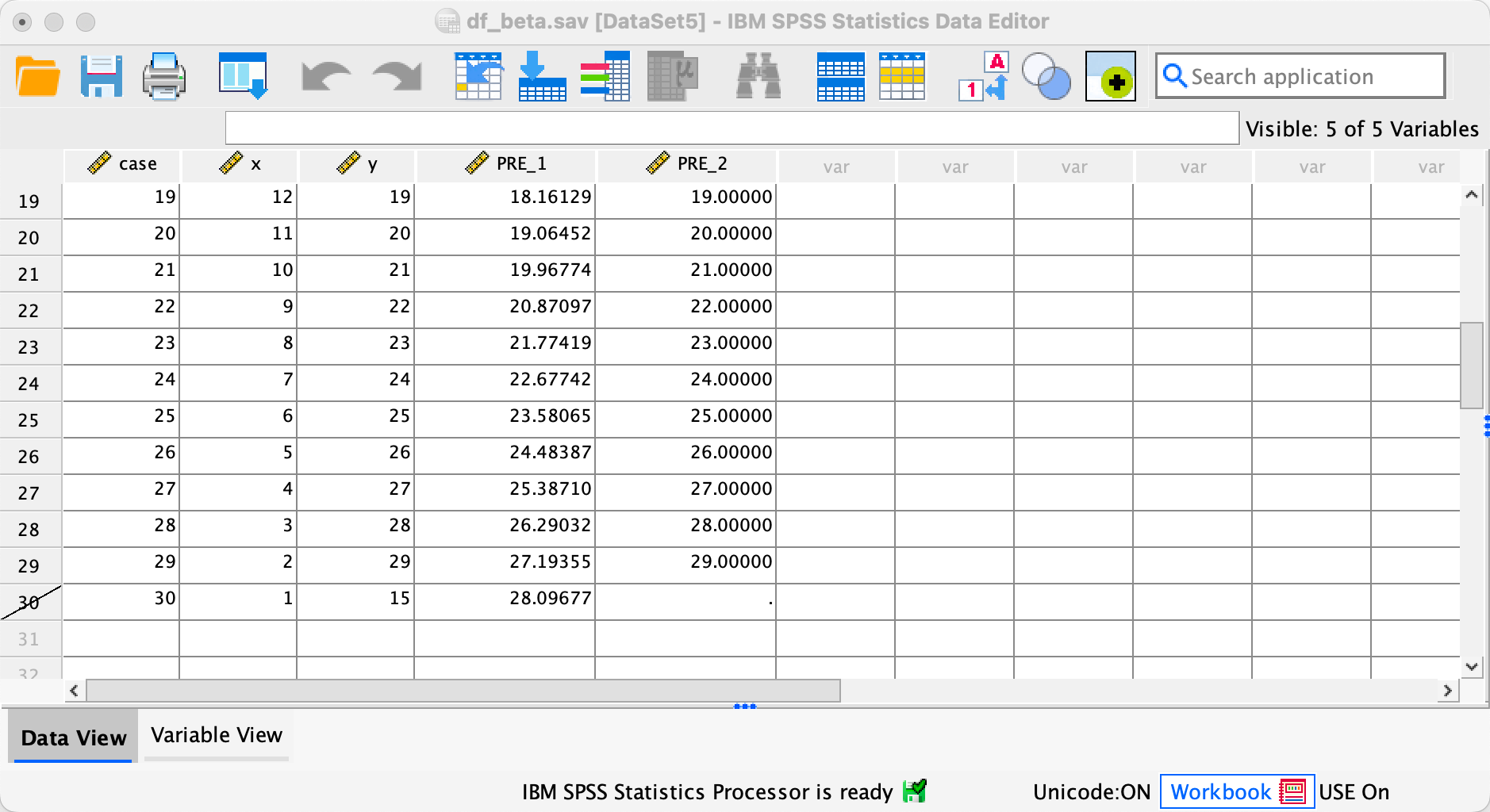
Once you have run both regressions, your data view should look like mine. You can see two new columns PRE_1 and PRE_2 which are the saved unstandardized predicted values that we requested.
Self-test 9.4
How is the t in Output 9.4 calculated? Use the values in the table to see if you can get the same value as SPSS.
The t is computed as follows:
\[ \begin{aligned} t &= \frac{b}{SE_b} \\ &= \frac{0.096}{0.010} \\ &= 9.6 \end{aligned} \]
This value is different to the value in the SPSS output (9.979) because we’ve used the rounded values displayed in the table. If you double-click the table, and then double click the cell for b and then for the SE we get the values to more decimal places:
\[ \begin{aligned} t &= \frac{b}{SE_b} \\ &= \frac{0.096124}{0.009632} \\ &= 9.979 \end{aligned} \]
which match the value of t computed by SPSS.
Self-test 9.5
How many albums would be sold if we spent £666,000 on advertising the latest album by Deafheaven?
Remember that advertising budget is in thousands, so we need to put £666 into the model (not £666,000). The b-values come from the SPSS output in the chapter:
\[ \begin{aligned} \widehat{\text{sales}}_i &= \hat{b}_0 + \hat{b}_1\text{advertising}_i \\ \widehat{\text{sales}}_i &= 134.14 + (0.096 \times \text{advertising}_i) \\ \widehat{\text{sales}}_i &= 134.14 + (0.096 \times 666) \\ \widehat{\text{sales}}_i &= 198.08 \end{aligned} \]
Self-test 9.6
Produce a matrix scatterplot of sales, adverts, airplay and image including the regression line.
Self-test 9.7
Think back to what the confidence interval of the mean represented. Can you work out what the confidence intervals for b represent?
This question is answered in the text just after the self-test box.
Chapter 10
Self-test 10.1
Enter these data into SPSS.
The file invisibility_cloak.sav shows how you should have entered the data.
Self-test 10.2
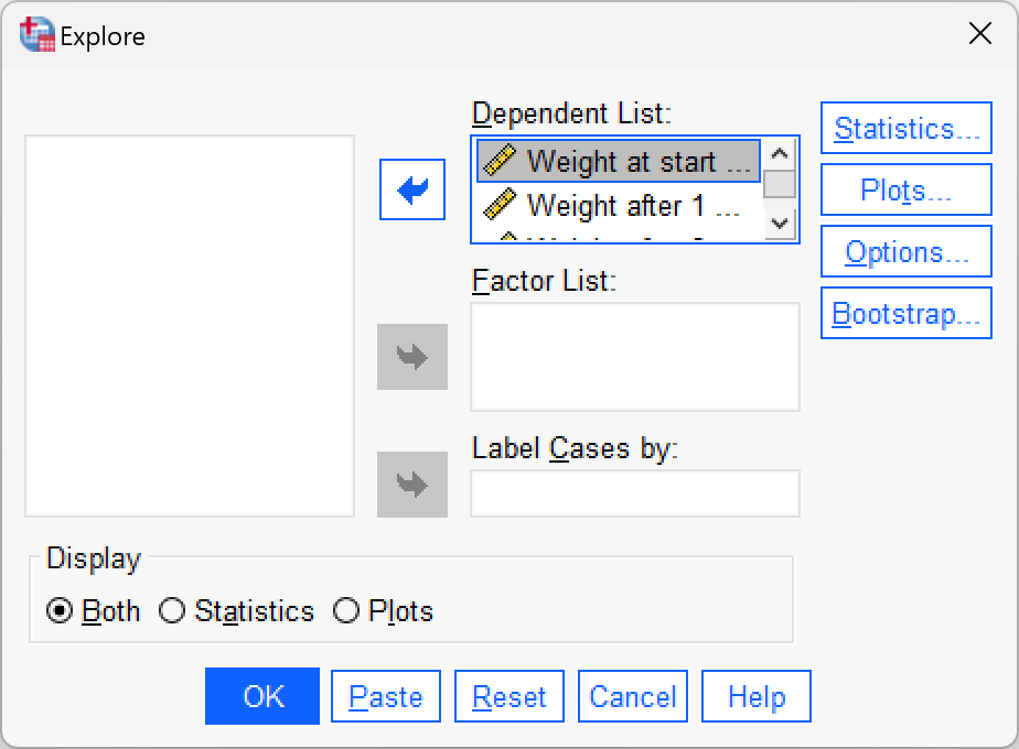
Produce some descriptive statistics for these data (using Explore)
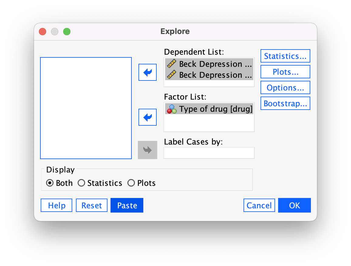
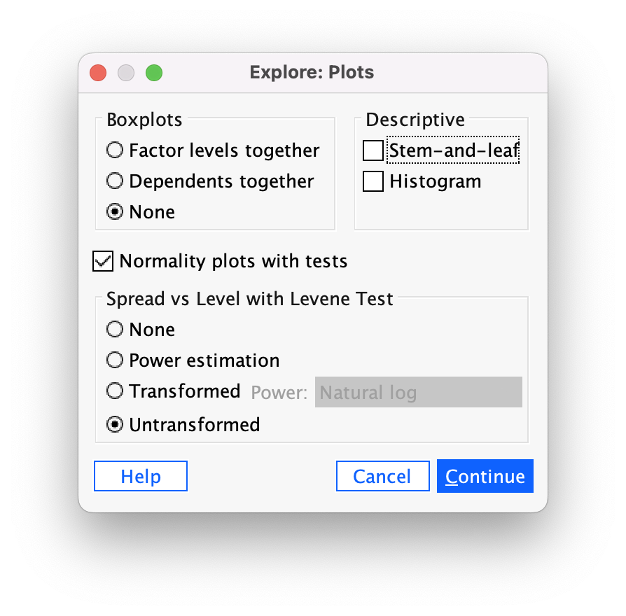
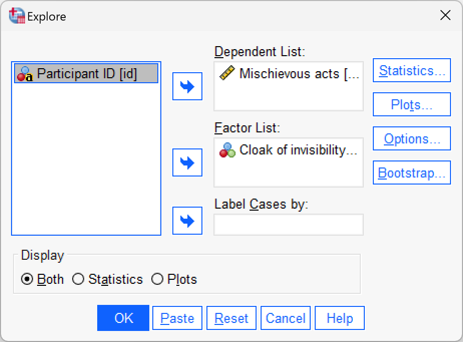
To get some descriptive statistics using the Explore command go to Analyze > Descriptive Statistics > Explore …. The dialog box for the Explore command is shown below. First, drag any variables of interest to the box labelled Dependent List. For this example, select Mischievous acts. To split the output by the different cloak groups drag cloak to the box labelled Factor List. If you click  a dialog box appears, but the default option is fine (it will produce means, standard deviations and so on). If you click
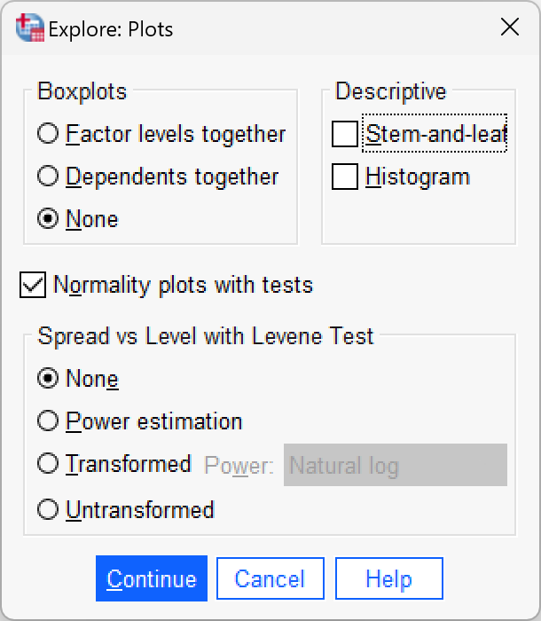
  and select the option Normality plots with tests, you will get the Kolmogorov-Smirnov test and some normal Q-Q plots in your output. Click to return to the main dialog box and to run the analysis.
Self-test 10.3
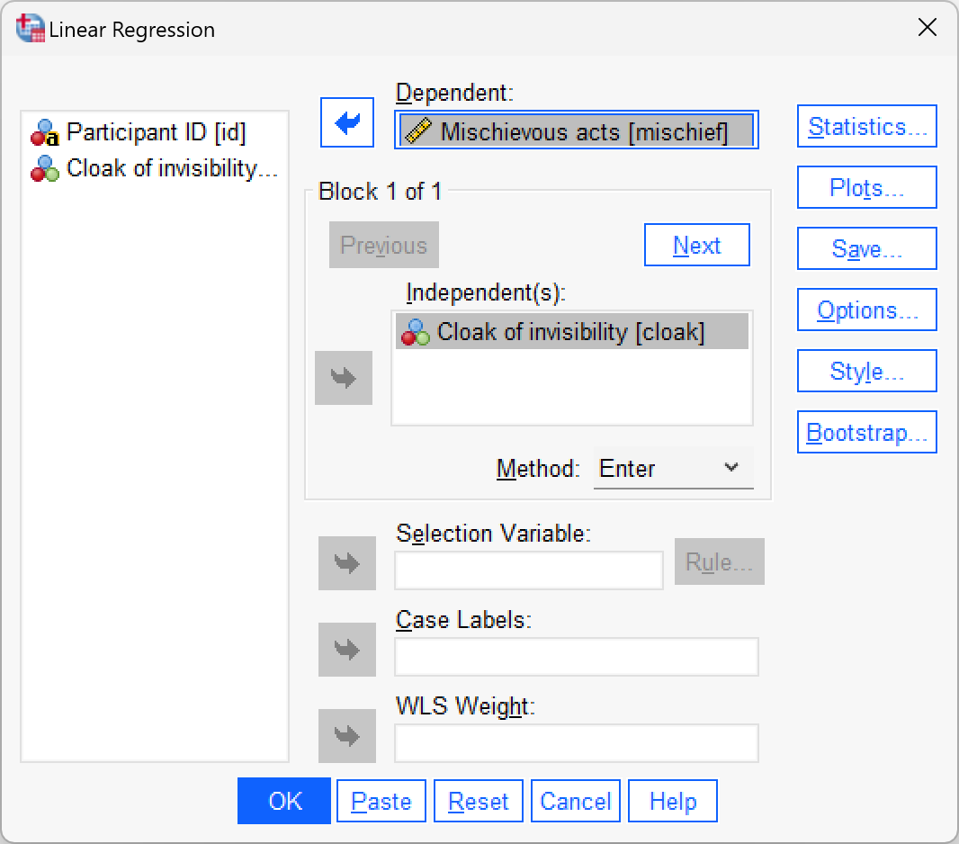
To prove that I’m not making it up as I go along, fit a linear model to the data in
invisibility_cloak.savwithcloakas the predictor andmischiefas the outcome using what you learnt in the previous chapter.cloakis coded using zeros and ones as described above.
Self-test 10.4
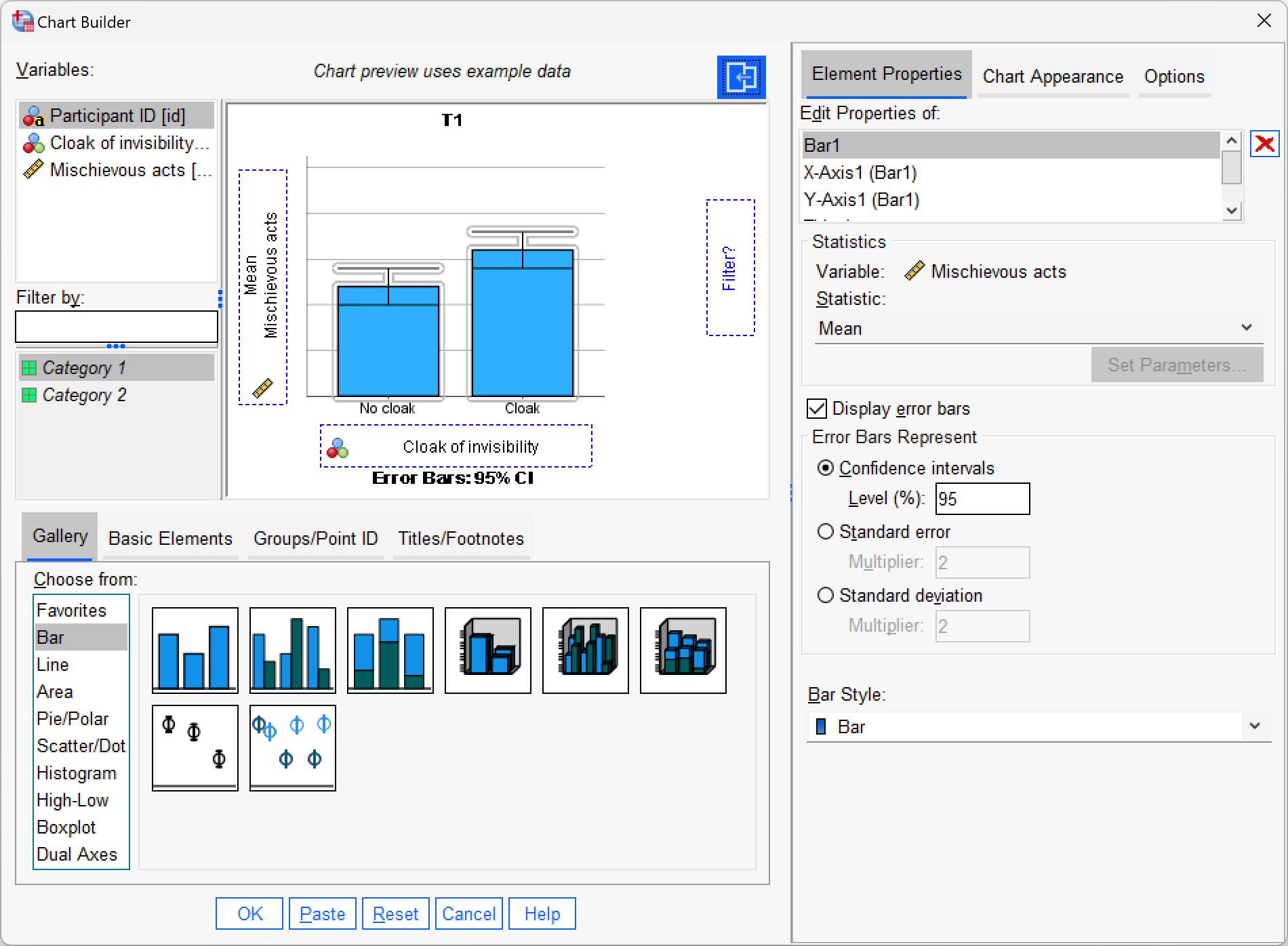
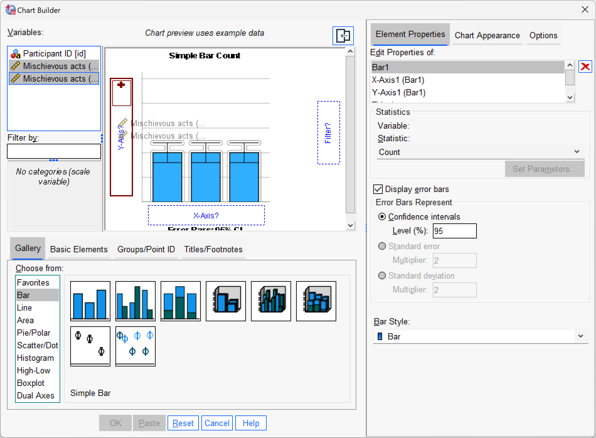
Produce an error bar chart of the
invisibility_cloak.savdata (cloakwill be on the x-axis andmischiefon the y-axis).
Self-test 10.5
Enter the data in Table 10.1 into the data editor as though a repeated-measures design was used.
We would arrange the data in two columns (one representing the cloak condition and one representing the no_cloak condition). You can see the correct layout in invisibility_rm.sav.
Self-test 10.6
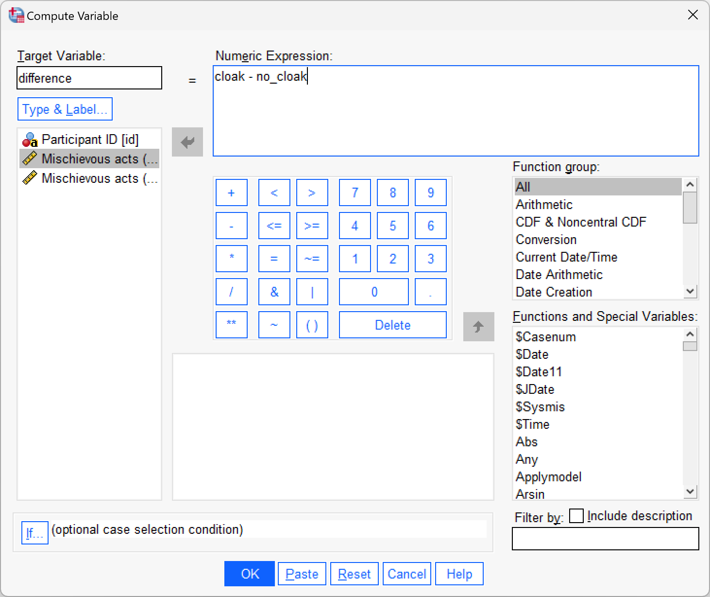
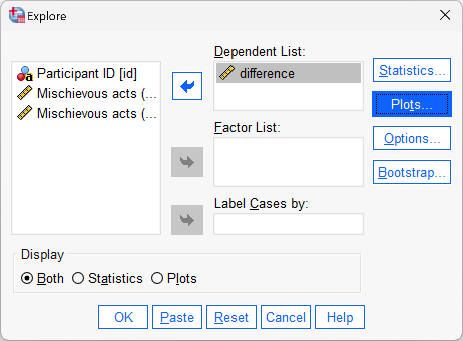
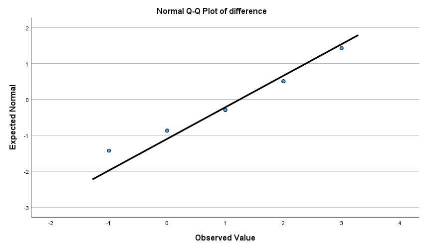
Using the invisibility_rm.sav data, compute the differences between the cloak and no cloak conditions and check the assumption of normality with a Q-Q plot.
First compute the differences using the compute function:
Next, use Analyze > Descriptive Statistics > Explore … to get some Q-Q plots:
The Q-Q plot shows that the quantiles fall pretty much on the diagonal line (indicating normality). As such, it looks as though we can assume that our differences are fairly normal and that, therefore, the sampling distribution of these differences is normal too. Happy days!
Self-test 10.7
Produce an error bar chart of the
invisibility_rm.savdata (cloakon the x-axis andmischiefon the y-axis).
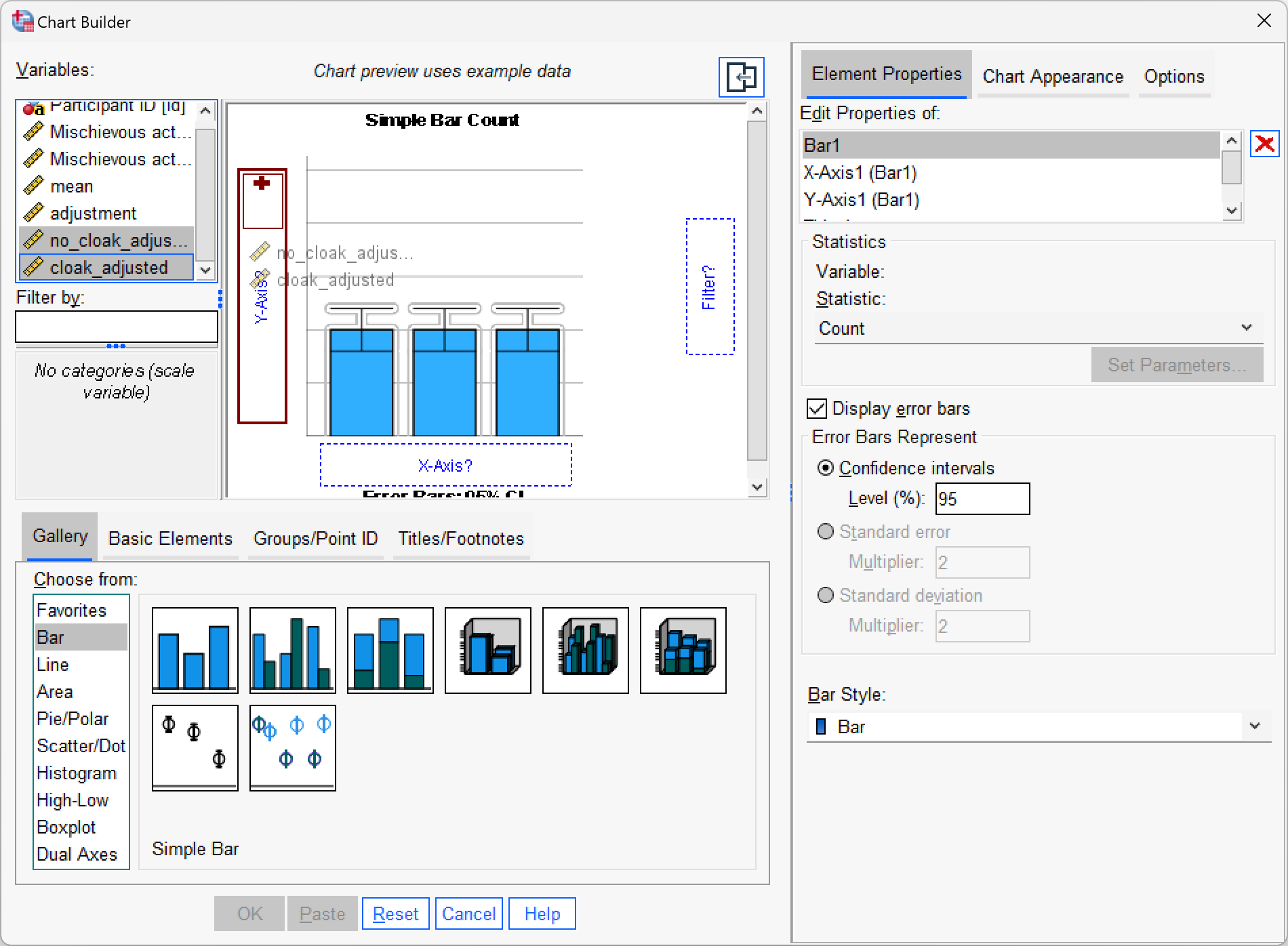
Self-test 10.8
Create an error bar chart of the mean of the adjusted values that you have just made (
cloak_adjustedandno_cloak_adjusted).
Chapter 11
Self-test 11.1
Follow Oliver Twisted’s instructions to create the centred variables
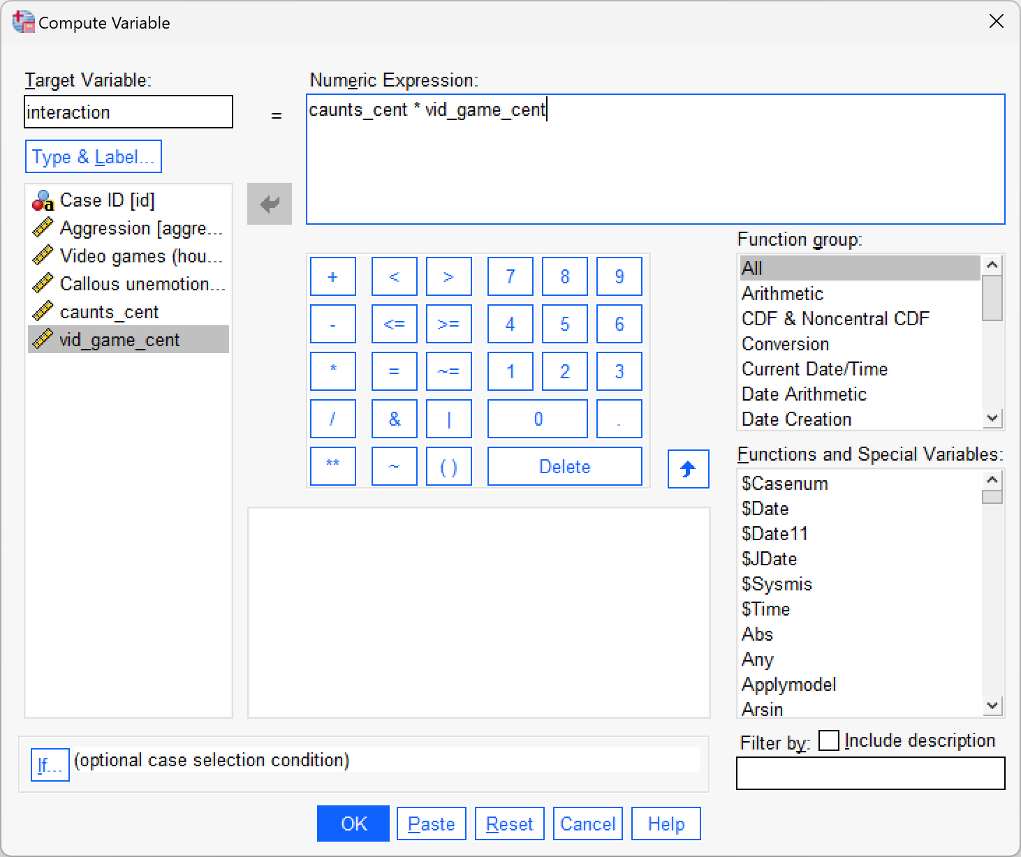
caunts_centandvid_game_cent. Then use the compute command to create a new variable calledinteractionin thevideo_games.savfile, which iscaunts_centmultiplied byvid_game_cent.
To create the centred variables follow Oliver Twisted’s instructions for this chapter. I’ll assume that you have a version of the data file video_games.sav containing the centred versions of the predictors (caunts_cent and vid_game_cent). To create the interaction term, access the compute dialog box by selecting Transform > Compute Variable … and enter the name interaction into the box labelled Target Variable. Drag the variable caunts_cent to the area labelled Numeric Expression, then click  and then select the variable
 vid_game_cent and drag it across to the area labelled Numeric Expression. The completed dialog box is shown below. Click and a new variable will be created called interaction, the values of which are caunts_cent multiplied by vid_game_cent.
Self-test 11.2
Assuming you have done the previous self-test, fit a linear model predicting
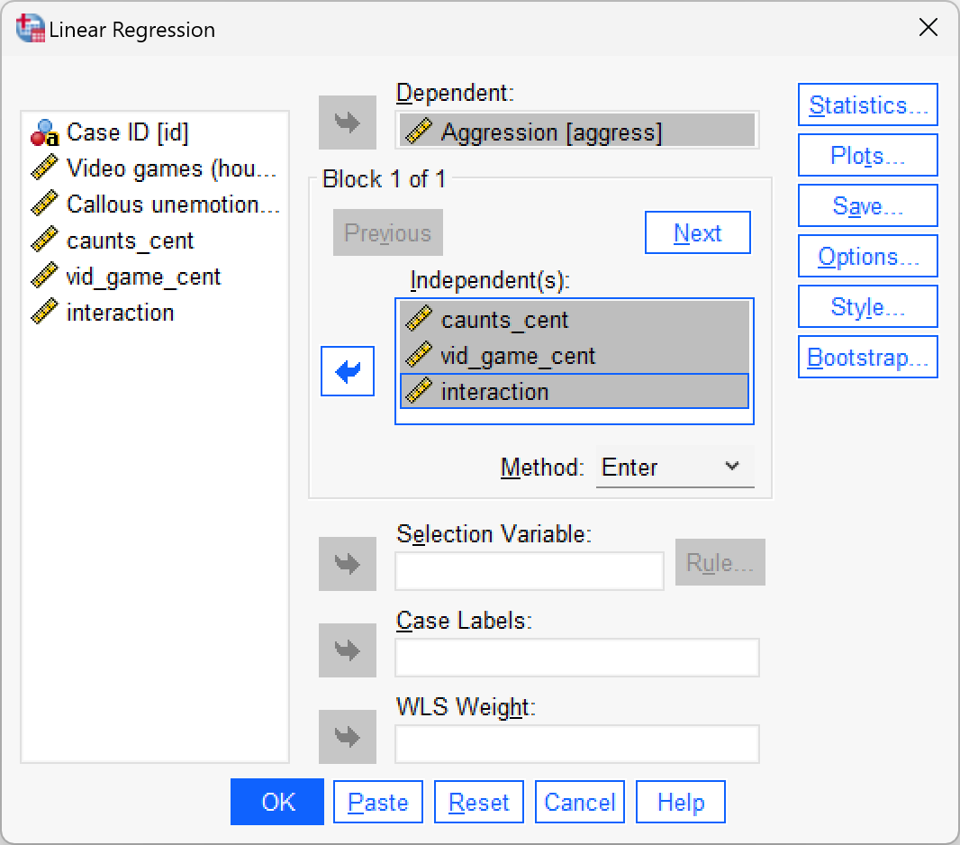
aggressfromcaunts_cent,vid_game_centand theirinteraction.
To do the analysis access the main dialog box by selecting Analyze > Regression > Linear …. The resulting dialog box is shown below. Drag aggress from the list on the left-hand side to the space labelled Dependent (or click ![]() ). Drag
). Drag caunts_cent, vid_game_cent and interaction from the variable list to the space labelled Independent(s) (click or click ![]() ). The default method of Enter is what we want, so click to run the basic analysis.
). The default method of Enter is what we want, so click to run the basic analysis.
Self-test 11.3
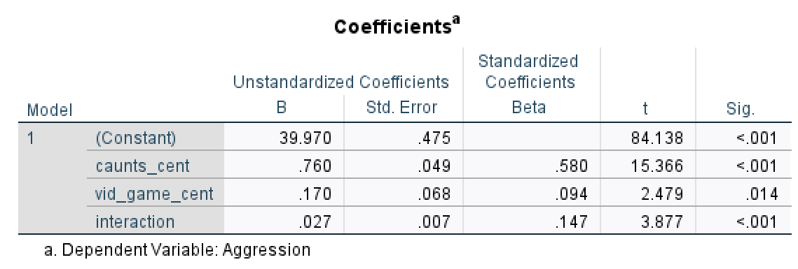
Assuming you did the previous self-test, compare the table of coefficients that you got with those in Output 11.1.
The output below shows the regression coefficients from the regression analysis that you ran using the centred versions of callous traits and hours spent gaming and their interaction as predictors. Basically, the regression coefficients are identical to those in Output 11.1 from using PROCESS. The standard errors differ a little from those from PROCESS, but that’s because when we used PROCESS we asked for heteroscedasticity-consistent standard errors, consequently the t-values are slightly different too (because these are computed from the standard errors: \(\sfrac{\hat{b}}{SE_{\hat{b}}}\)). The basic conclusion is the same though: there is a significant moderation effect as shown by the significant interaction between hours spent gaming and callous unemotional traits.
Self-test 11.4
Fit the three models necessary to test mediation for Lambert et al’s data: (1) a linear model predicting
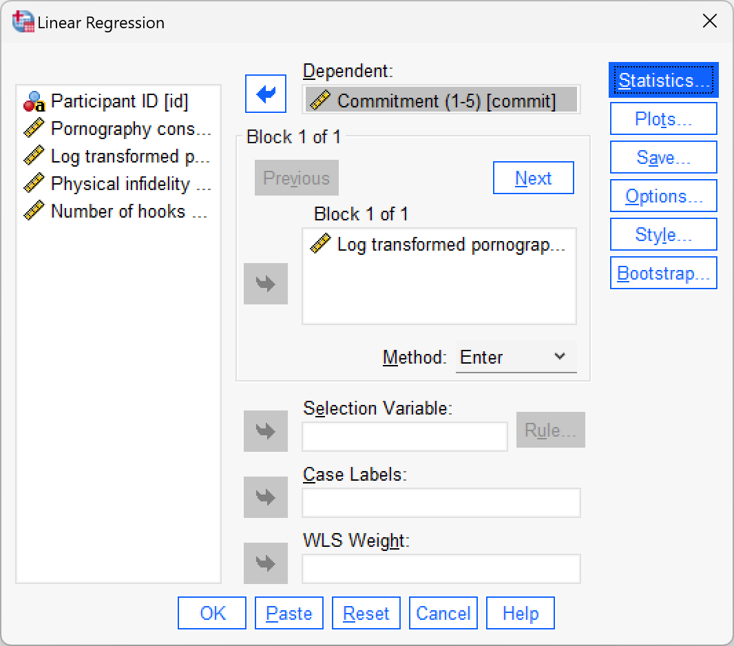
phys_inffromln_porn; (2) a linear model predictingcommitfromln_porn; and (3) a linear model predictingphys_inffrom bothln_pornandcommit. Is there mediation?
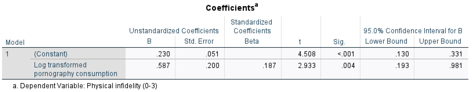
Model 1: Predicting infidelity (phys_inf) from pornography consumption (ln_porn)

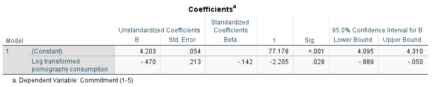
Model 2: Predicting relationship commitment (commit) from pornography consumption (ln_porn)
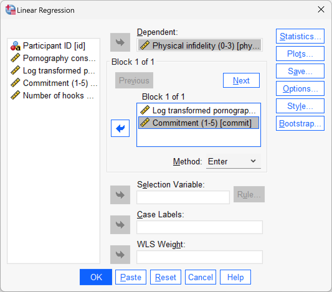
Model 3: Predicting infidelity (phys_inf) from pornography consumption (ln_porn) and relationship commitment (commit)
Interpretation
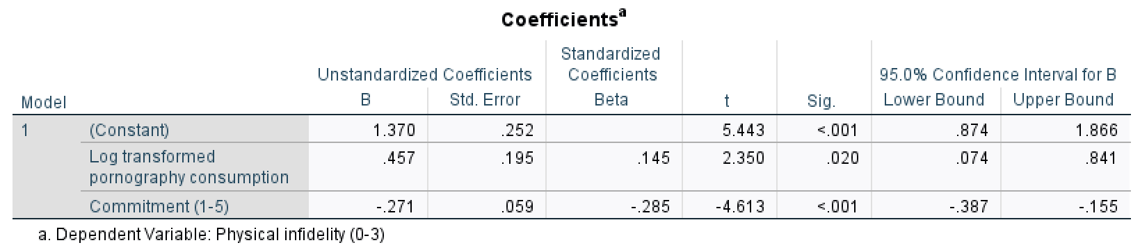
- Model 1 shows that pornography consumption significantly predicts infidelity, \(\hat{b} = 0.59\), 95% CI [0.19, 0.98], t = 2.93, p = .004. As consumption increases, physical infidelity increases also.
- Model 2 shows that pornography consumption significantly predicts relationship commitment, \(\hat{b} = -0.47\), 95% CI [\(-0.89\), \(-0.05\)], t = \(-2.21\), p = .028. As pornography consumption increases, commitment declines.
- Model 3 shows that relationship commitment significantly predicts infidelity, \(\hat{b} = -0.27\), 95% CI [\(-0.39\),\(-0.16\)], t = \(-4.61\), p < .001. As relationship commitment increases, physical infidelity declines.
- The relationship between pornography consumption and infidelity is stronger in model 1, \(\hat{b} = 0.59\), than in model 3, \(\hat{b} = 0.46\).
As such, the four conditions of mediation have been met.
Chapter 12
Self-test 12.1
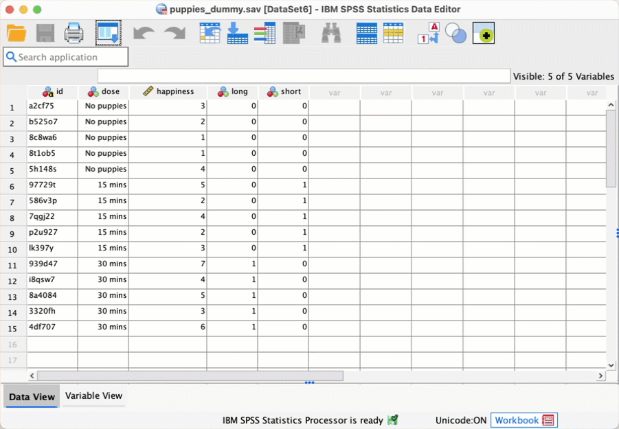
To illustrate what is going on I have created a file called
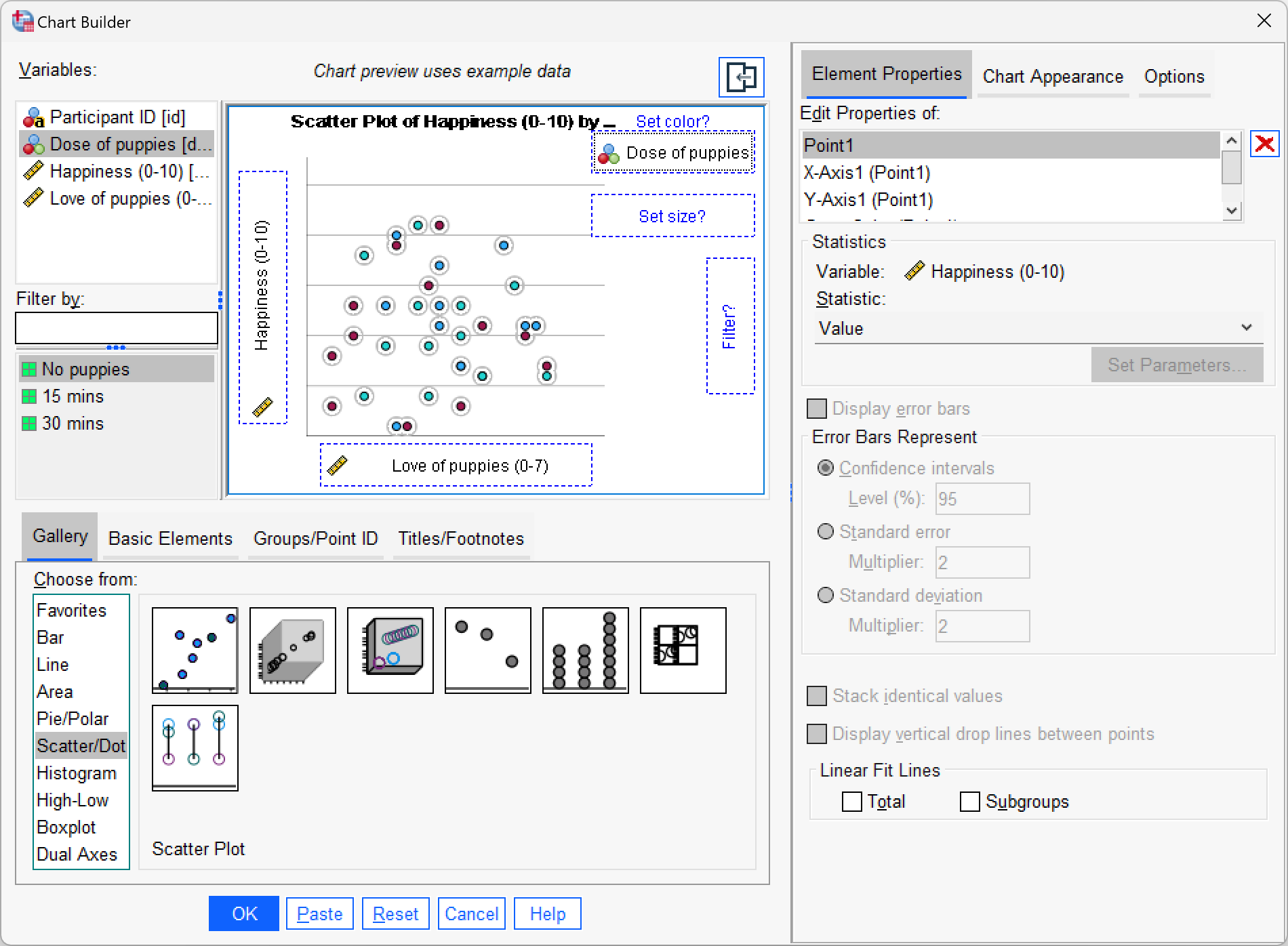
puppies_dummy.savthat contains the puppy therapy data along with the two dummy variables (shortandlong) we’ve just discussed (Table 12.4). Fit a linear model predicting happiness fromshortandlong.
Self-test 12.2
To illustrate these principles, I have created a file called
puppies_contrast.savin which the puppy therapy data are coded using the contrast coding scheme used in this section. Fit a linear model usinghappinessas the outcome andpuppies_vs_noneandshort_vs_longas the predictor variables (leave all default options).

Self-test 12.3
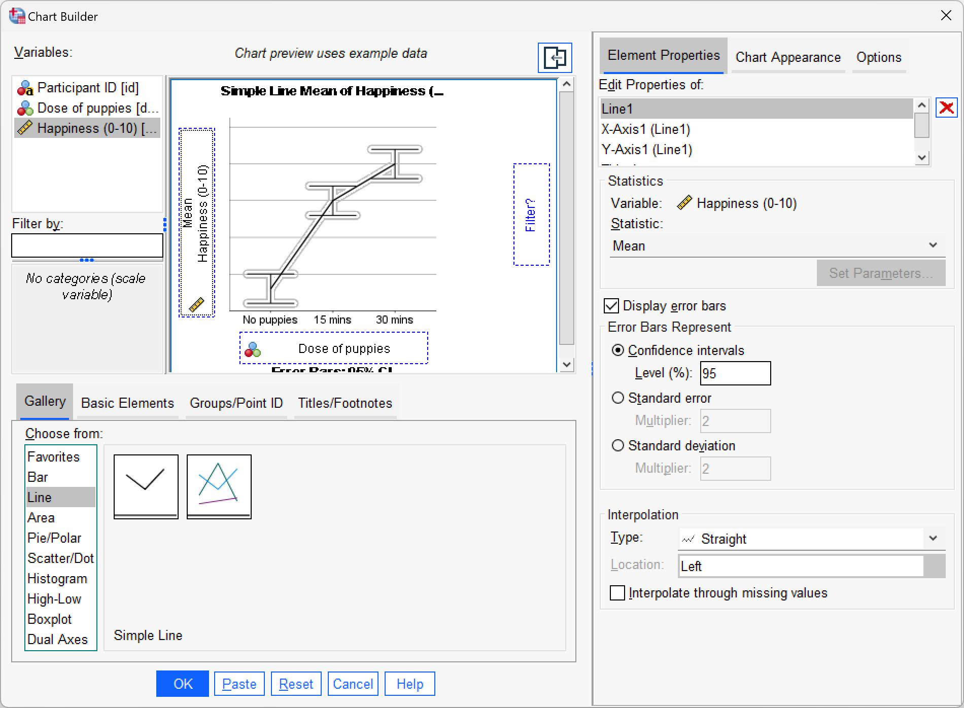
Produce a line chart with error bars for the puppy therapy data.
Self-test 12.4
Can you explain the contradiction between the planned contrasts and post hoc tests?
The answer is given in the book chapter.
Chapter 13
Self-test 13.1
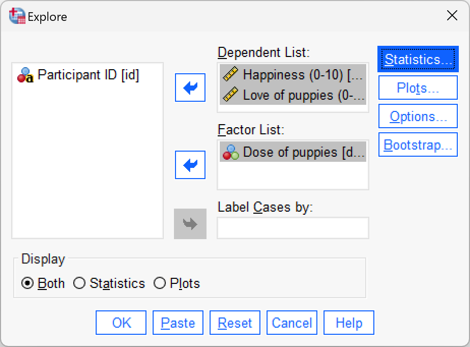
Use SPSS Statistics to find the means and standard deviations of both happiness and love of puppies across all participants and within the three groups.
You could do this using the Analyze > Descriptive Statistics > Explore dialog box:
Answers are in Table 13.2 of the chapter.
Self-test 13.2
Add two dummy variables to the file
puppy_love.savthat compare the 15 minutes to the control (low_control) and the 30 minutes to the control (high_control) – see Section 12.3.1 for help.
The data should look like the file puppy_love_dummy.sav.
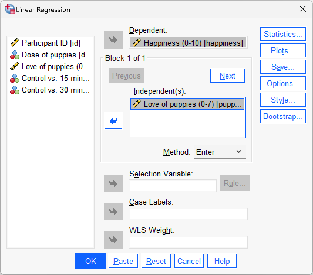
Self-test 13.3
Fit a hierarchical regression with
happinessas the outcome. In the first block enter love of puppies (puppy_love) as a predictor, and then in a second block enter bothlow_controlandhigh_control(forced entry) – see Section 9.10 for help.
To get to the main regression dialog box select Analyze > Regression > Linear …. Drag the outcome variable (Puppy_love) the box labelled Dependent (or click ![]() ). To specify the predictor variable for the first block we drag
). To specify the predictor variable for the first block we drag puppy_love to the box labelled Independent(s) (or click ![]() . Underneath the Independent(s) box, there is a drop-down menu for specifying the Method of regression. The default option is forced entry, and this is the option we want.
. Underneath the Independent(s) box, there is a drop-down menu for specifying the Method of regression. The default option is forced entry, and this is the option we want.
To specify the second block click  . This process clears the Independent(s) box so that you can enter the new predictors (you should also note that above this box it now reads Block 2 of 2, indicating that you are in the second block of the two that you have so far specified). The second block must contain both of the dummy variables, so you should drag on
 Low_Control and High_Control from the variable list to the Independent(s) box (or click ![]() ). We also want to leave the method of regression set to Enter.
). We also want to leave the method of regression set to Enter.
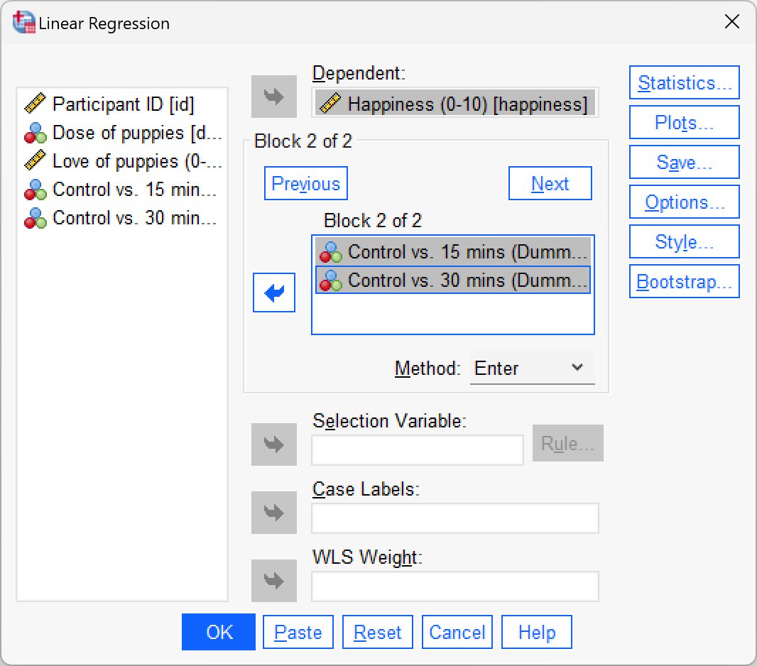
Outut 13.1 (in the book) shows the results that you should get and the text in the chapter explains this output.
Self-test 13.4
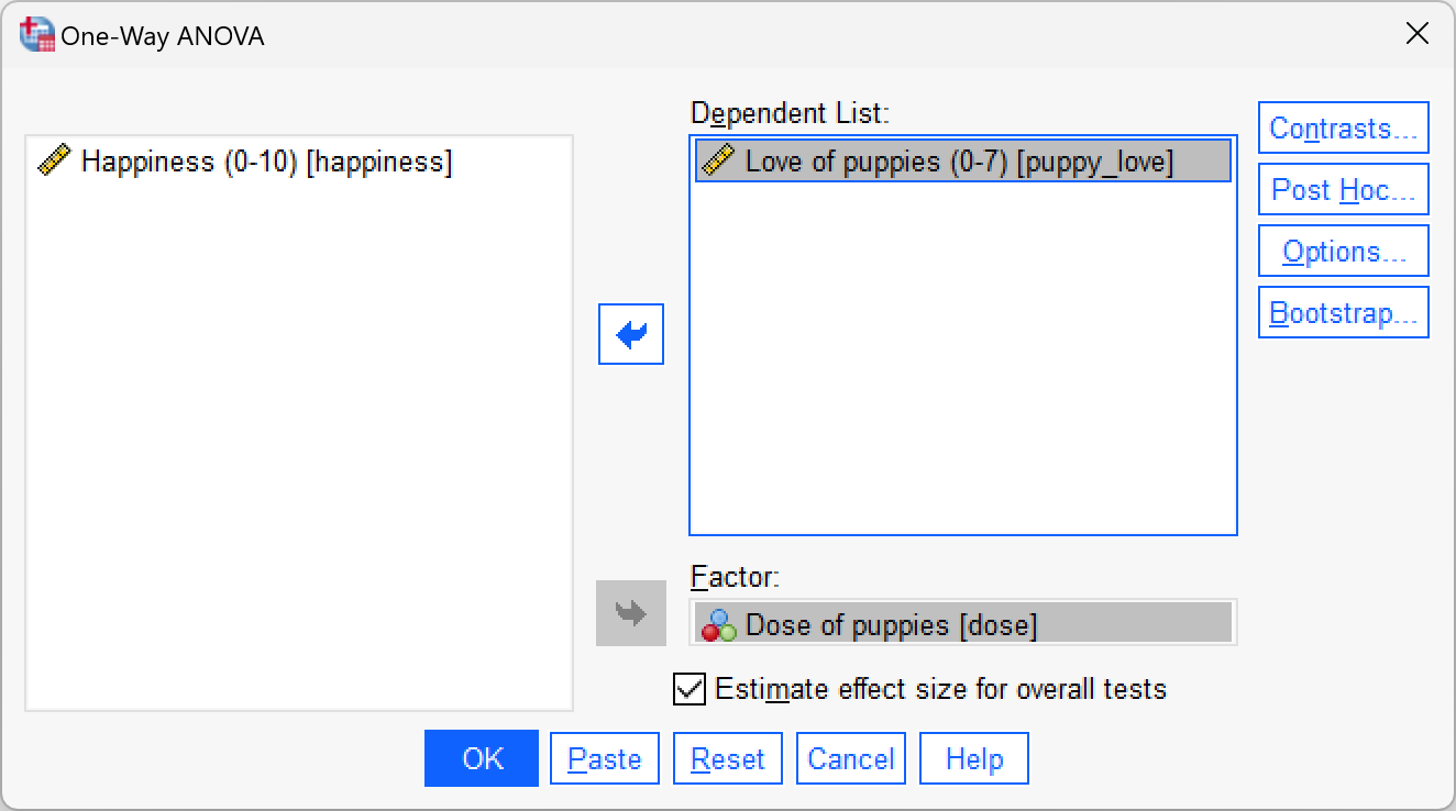
Fit a model to test whether love of puppies (our covariate) is independent of the dose of puppy therapy (our independent variable).
We can do this analysis by selecting either Analyze > Compare Means > One-Way ANOVA… or Analyze > General Linear Model > Univariate…. If we do the latter then we can follow the example in the chapter but drag the covariate (Puppy_love) to the box labelled Dependent Variable and exclude Happiness from the model. The completed dialog box would look like this:
Self-test 13.5
Fit the model without the covariate to see whether the three groups differ in their levels of happiness.
We can do this analysis by selecting either Analyze > Compare Means > One-Way ANOVA… or Analyze > General Linear Model > Univariate…. If we do the latter then we can follow the example in the chapter exclude the covariate (Puppy_love). The completed dialog box would look like this:
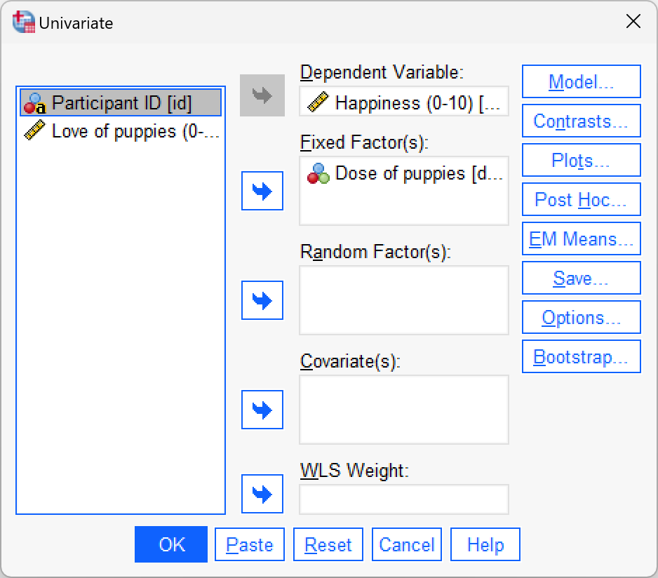
The output is in the book chapter.
Self-test 13.6
Produce a scatterplot of love of puppies (horizontal axis) against happiness (vertical axis).
The scatterplot itself is in the book chapter.
Chapter 14
Self-test 14.1
The file
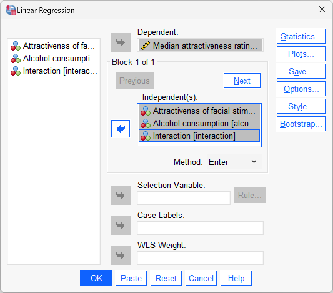
goggles_regression.savcontains the dummy variables used in this example. Just to prove that this works, use this file to fit a linear model predicting attractiveness ratings fromfacetype,alcoholand theinteractionvariable.
Select Analyze > Regression > Linear … and complete the dialog box as below. The output is shown in Output 14.1 of the book.
Self-test 14.2
What about panels (c) and (d): do you think there is an interaction?
This question is answered in the text in the chapter.
Self-test 14.3
Use the Chart Builder to plot an error bar graph of the attractiveness ratings with alcohol consumption on the x-axis and different coloured lines to represent whether the faces being rated were unattractive or attractive.
Select Graphs > Chart Builder … and complete the dialog box as below.

Chapter 15
Self-test 15.1
What is a repeated-measures design? (Clue: it is described in Chapter 1.)
Repeated-measures is a term used when the same entities participate in all conditions of an experiment.
Self-test 15.2
Devise some contrast codes for the contrasts described in the text.
The answer is in Table 15.3 in the chapter.
Self-test 15.3
Thinking back to the order in which we specified the levels of Entity (Section 15.8.1), what groups are being compared in each contrast?
Given the order in which we specified the levels of Entity, contrast 1 compares the mannequin and human, contrast 2 compares the shapeshifter to the human, and contrast 3 compares the alien to the shapeshifter.
Chapter 16
Self-test 16.1
In the data editor create nine variables with the names and variable labels given in Figure 16.3. Create a variable strategy with value labels 0 = normal, 1 = hard to get.
The data in the file speed_date.sav show how the variables should be set up.
Self-test 16.2
Enter the data as in Table 16.1. If you have problems then use the file
speed_date.sav.
The data in the file speed_date.sav show how the variables should be set up.
Self-test 16.3
Output 16.2 shows information about sphericity. Based on what you have already learnt, what would you conclude form this information?
Answers are in the text within the chapter.
Self-test 16.4
What is the difference between a main effect and an interaction?
A main effect is the unique effect of a predictor variable (orindependent variable) on an outcome variable. In this context it can be the effect of strategy, charisma or looks on their own. So, in the case of strategy, the main effect is the difference between the average ratings of all dates that played hard to get (irrespective of their attractiveness or charisma) and all dates that acted typically (irrespective of their attractiveness or charisma).
The main effect of looks would be the mean rating given to all attractive dates (irrespective of their charisma, or whether they played hard to get or not), compared to the average rating given to all average-looking dates (irrespective of their charisma, or whether they played hard to get or not) and the average rating of all ugly dates (irrespective of their charisma, or whether they played hard to get or acted normally).
An interaction, on the other hand, looks at the combined effect of two or more variables: for example, were the average ratings of attractive, ugly and average-looking dates different when those dates played hard to get compared to when they did not?
Self-test 16.5
Was the assumption of homogeneity of variance met (Output 16.4)?
Answers are in the text within the chapter.
Self-test 16.6
Based on the previous section, on what you have learned in previous chapters, and on Output 16.3, can you interpret the main effect of looks?
Answers are in the text within the chapter.
Chapter 17
Self-test 17.1
What is a cross-product?
Cross-products represent a total value for the combined error between two variables (in some sense they represent an unstandardized estimate of the total correlation between two variables).
Self-test 17.2
Why might the univariate tests be non-significant when the multivariate tests were significant?
The answer is in the chapter:
“The reason for the anomaly is that the multivariate test takes account of the correlation between outcome variables and looks at whether groups can be distinguished by a linear combination of the outcome variables. This suggests that it is not thoughts or actions in themselves that distinguish the therapy groups, but some combination of them. The discriminant function analysis will provide more insight into this conclusion.”
Self-test 17.3
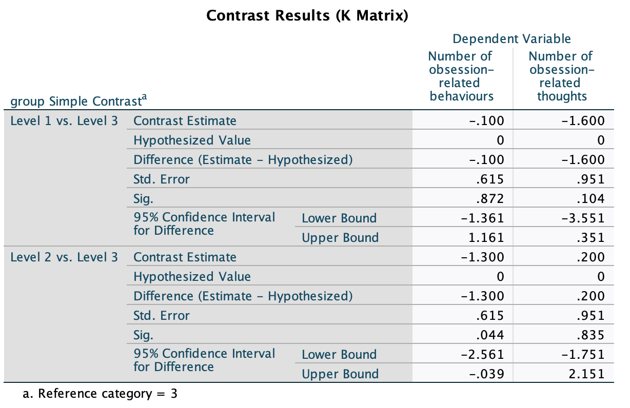
Based on what you have learnt in previous chapters, interpret the table of contrasts in your output.
In the chapter I suggested carrying out a simple contrast that compares each of the therapy groups to the no-treatment control group. The output below shows the results of these contrasts. The table is divided into two sections conveniently labelled Level 1 vs. Level 3 and Level 2 vs. Level 3 where the numbers correspond to the coding of the group variable. If you coded the group variable using the same codes as I did, then these contrasts represent CBT vs. NT and BT vs. NT respectively. Each contrast is performed on both dependent variables separately and so they are identical to the contrasts that would be obtained from a univariate ANOVA. The table provides values for the contrast estimate and the hypothesized value (which will always be zero because we are testing the null hypothesis that the difference between groups is zero). The observed estimated difference is then tested to see whether it is significantly different from zero based on the standard error. A 95% confidence interval is produced for the estimated difference.
The first thing that you might notice (from the values of Sig.) is that when we compare CBT to NT there are no significant differences in thoughts (p = 0.104) or behaviours (p = 0.872) because both values are above the 0.05 threshold. However, comparing BT to NT, there is no significant difference in thoughts (p = 0.835) but there is a significant difference in behaviours between the groups (p = 0.044). The confidence intervals confirm these findings: they all include zero (the lower bounds are negative whereas the upper bounds are positive) except for the BT vs. NT contrast for behaviours. Assuming that these intervals are from the 95% that contain the population value, this means that all of these effects might be 0 in the population, except for the effect of BT vs. NT for behaviours. This finding is a little unexpected because the univariate ANOVA for behaviours was non-significant and so we would not expect there to be significant group differences.
Chapter 18
Self-test 18.1
What is the equation of a straight line/linear model?
As shown in the book:
\[ Y_i = b_1X_{\text{1}i} + b_2X_{\text{2}i} + \ldots + b_nX_{ni} \]
Self-test 18.2
Having done this, select the Direct oblimin option in Figure 18.12 and repeat the analysis. You should obtain two outputs identical in all respects except that one used an orthogonal rotation and the other an oblique.
This should be self-explanatory from the book chapter.
Self-test 18.3
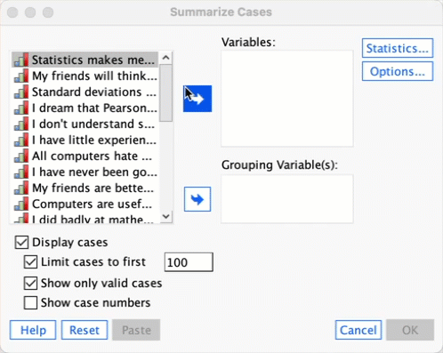
Use the case summaries command (Section 9.11.6) to list the factor scores for these data (given that there are over 2500 cases, restrict the output to the first 10).
To list the factor scores select Analyze > Reports > Case Summaries …. Drag the variables that you want to list (in this case the four columns of factor scores) to the box labelled Variables. By default, SPSS will limit the output to the first 100 cases, but let’s set this to 10 so we just look at the first few cases (as in the book chapter).
Self-test 18.4
Thinking back to Chapter 1, what are reliability and test–retest reliability?
The answer is given in the text.
Self-test 18.5
Use the compute command to reverse-score item 3 and store as a variable called
question_03_rev(see Chapter 6; remember that you are changing the variable to 6 minus its original value).
To access the compute dialog box, select Transform > Compute Variable …. Enter the name of the variable that we want to change in the space labelled Target Variable (in this case the variable is called question_03_rev). Then, where it says Numeric Expression you need to tell SPSS how to compute the new variable. In this case, we want to take each person’s original score on item 3, and subtract that value from 6. Therefore, we type 6–Question_03 (which means 6 minus the value found in the column labelled question_03). If you’ve used the same name then when you click you’ll get a dialog box asking if you want to change the existing variable; click if you’re happy for the new values to replace the old ones.

Self-test 18.6
Run reliability analysis on the other three subscales.
The outputs and interpretation are in the chapter.
Chapter 19
Self-test 19.1
Fit a linear model with
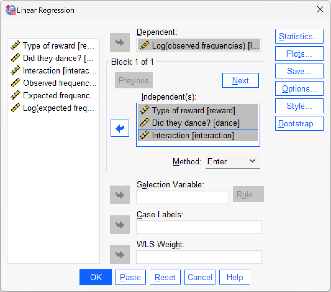
ln_observedas the outcome, andtraining,danceandinteractionas the three predictors.
The multiple regression dialog box will look like the figure below. We can leave all of the default options as they are because we are interested only in the regression parameters. The regression parameters are shown in the book.
Self-test 19.2
Fit another linear model using
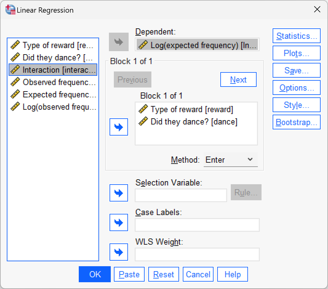
cat_reg.sav. This time the outcome is the log of expected frequencies (ln_expected) andtraininganddanceare the predictors (the interaction is not included).
The multiple regression dialog box will look like this:
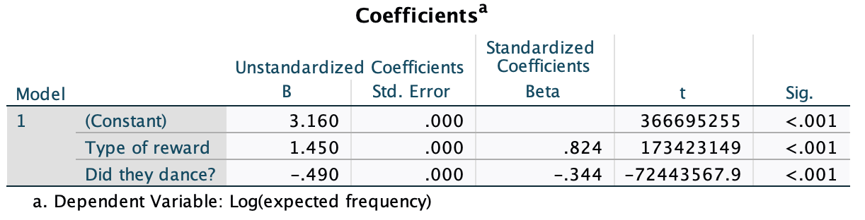
We can leave all of the default options as they are because we are interested only in the regression parameters. The resulting regression parameters are shown below. Note that \(\hat{b}_0\) = 3.16, the beta coefficient for the type of training is 1.45 and the beta coefficient for whether they danced is 0.49. All of these values are consistent with those calculated in the book chapter.
Self-test 19.3
Using the
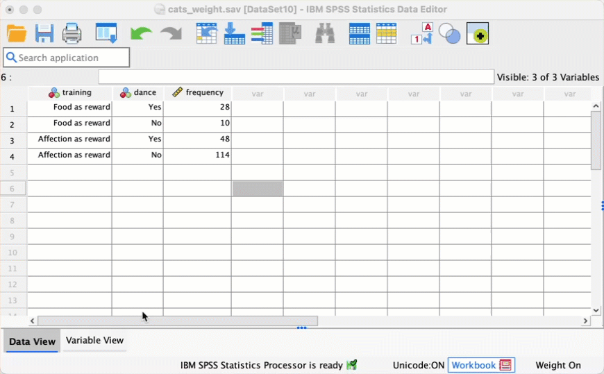
cats_weight.savdata, change the frequency of cats that had food as reward and didn’t dance from 10 to 28. Re-do the chi-square test and select and interpret z-tests. Is there anything about the results that seems strange?
You need to change the score then follow the instructions in the book to run the analysis. This screencast might help:
The contingency table you get looks like this:
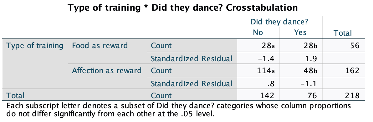
In the row labelled Food as Reward the count of 28 in the column labelled Yes has a subscript letter a, and in the column labelled No the count of 28 has a subscript letter b. These subscripts tell us the results of the z-test that we asked for: columns with different subscripts have significantly different column proportions. This is what should strike you as strange: how can it be that two identical counts of 28 can be deemed significantly different? The answer is that despite the subscripts being attached to the counts, that isn’t what they compare: they compare the proportion of the total frequency of each column that falls into that row against the proportion of the total frequency of the second column that falls into that row. In this case, the first column represents all the cats that danced (n = 76). Within this column, 28/76 = 36.8% had food (i.e. fell into the row representing food as a reward). In other words, of all the cats that danced 36.8% had food. the second column represents all of the cats that did not dance (n = 142). Within this column 28/142 = 19.7% had food. In other words, of all the cats that did not dance, 19.7% had food. The significance test is testing whether these proportions are different to each other: it’s testing whether 19.7% is different from 36.8%, and it is (p < 0.05), which is why the column counts have been denoted with different letters.
Self-test 19.4
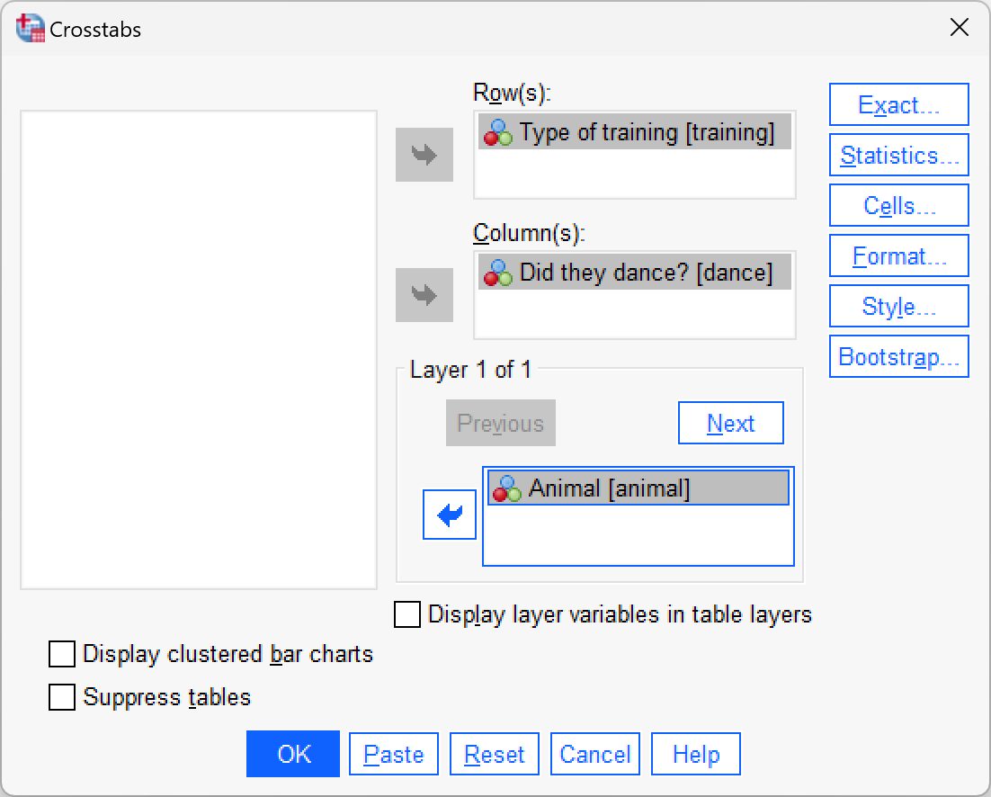
Use Section 19.7.3 to help you to create a contingency table with dance as the columns, training as rows and animal as a layer.
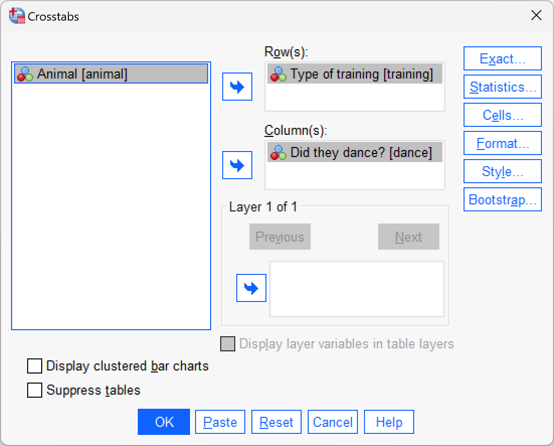
Select Analyze > Descriptive Statistics > Crosstabs …. We have three variables in our crosstabulation table: whether the animal danced or not (dance), the type of reward given (training), and whether the animal was a cat or dog (animal). Drag training into the box labelled Row(s) (or click ![]() ). Next, drag
). Next, drag dance to the box labelled Column(s) (or click ![]() ). Finally,drag
). Finally,drag animal to the box labelled Layer 1 of 1 (or click ![]() ). The completed dialog box should look like this:
). The completed dialog box should look like this:
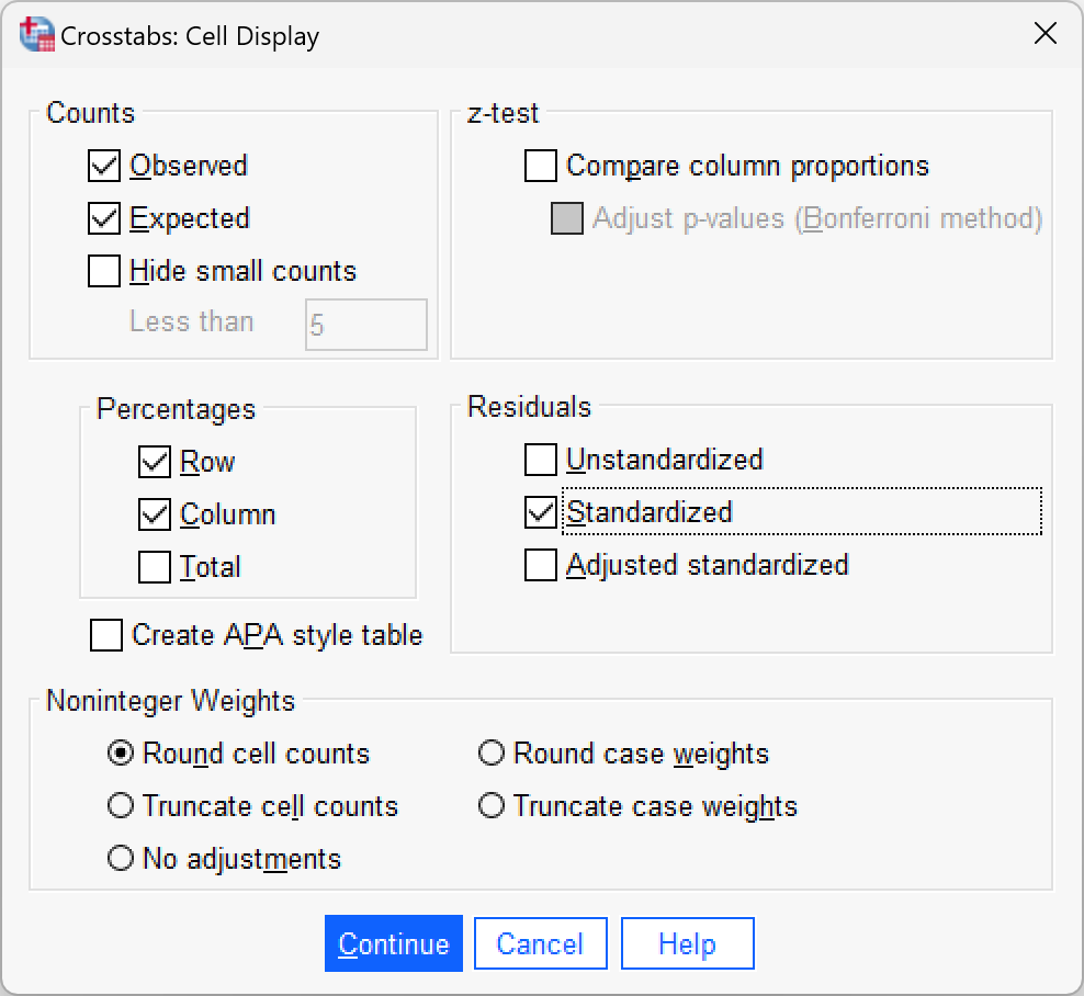
Click  and select these options:
Self-test 19.5
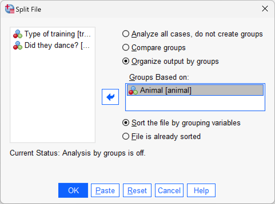
Use the split file command (see Section 6.10.4) to run a chi-square test on
danceandtrainingfor dogs and cats.
Select Date > Split File … and then select Organize output by groups. Once this option is selected, the Groups Based on box will activate. Drag Animal) into this box (or click ![]() ):
):
To run the chi-square tests, select Analyze > Descriptive Statistics > Crosstabs …. Drag training into the box labelled Row(s) (or click ![]() ). Next, drag
). Next, drag dance to the box labelled Column(s) (or click ![]() ). The completed dialog box should look like this:
). The completed dialog box should look like this:
Select the same options as in the book (for the cat example).
Chapter 20
Self-test 20.1
Using equations 20.23 and 20.25, calculate the values of Cox and Snell’s and Nagelkerke’s \(R^2\). (Remember the sample size, N, is 113.)
SPSS reports \(-2LL_\text{new}\) as 144.16 and \(-2LL_\text{baseline}\) as 154.08. The sample size, N, is 113. So Cox and Snell’s \(R^2\) is calculated as follows:
\[ \begin{aligned} R_{\text{CS}}^2 &= 1-exp\bigg(\frac{-2LL_\text{new}-(-2LL_\text{baseline})}{n}\bigg) \\ &= 1-exp\bigg(\frac{144.16-154.08}{113}\bigg) \\ &= 1-exp(-0.0878) \\ &= 1-e^{-0.0878} \\ &= 0.084 \end{aligned} \]
Nagelkerke’s adjustment is calculated as:
\[ \begin{aligned} R_{\text{N}}^2 &= \frac{R_{\text{CS}}^2}{1-exp(-(\frac{-2LL_\text{baseline}}{n}))} \\ &= \frac{0.084}{1-exp(-(\frac{154.08}{113}))} \\ &= \frac{0.084}{1-e^{-1.3635}} \\ &= \frac{0.084}{1-0.2558} \\ &= 0.113 \end{aligned} \]
Self-test 20.2
Use the case summaries function to create a table for the first 15 cases in the file
eel.savshowing the values ofcured,intervention,duration, the predicted probability (PRE_1) and the predicted group membership (PGR_1) for each case.
The completed dialog box should look like this:

Self-test 20.3
Why might the model be better at classifying scored penalty kicks?
This question is answered in the book:
“The classification table gives us a clue as to why scored penalties are better predicted than missed ones. The vast majority of kicks are scored because people tend not to end up as professional soccer players unless they’re extremely good at kicking footballs. Of the 868 penalties in the data 793 are scored and only 75 missed!”
Self-test 20.4
Try creating a new variable that is the natural logs of position called
ln_position.
Select Transform > Compute Variable … and complete the dialog box as follows:

Chapter 21
Self-test 21.1
Produce a scatterplot of
days(x-axis) againstpost_qol(y-axis), with each clinic plotted as a different line. Include a line of best fit for each clinic.
Select Graphs > Chart Builder … and then complete the dialog box as follows
Self-test 21.2
Refit the model using
monthsinstead ofdays.
Select Analyze > Mixed Models > Linear … and complete the dialog boxes as follows:
Self-test 21.3
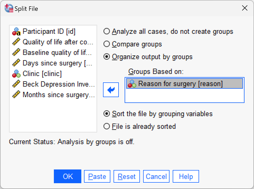
Split the file by
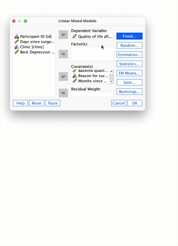
reasonand then run a multilevel model predictingpost_qolwith a random intercept, and random slopes formonths, and includingbase_qolandmonthsas predictors..
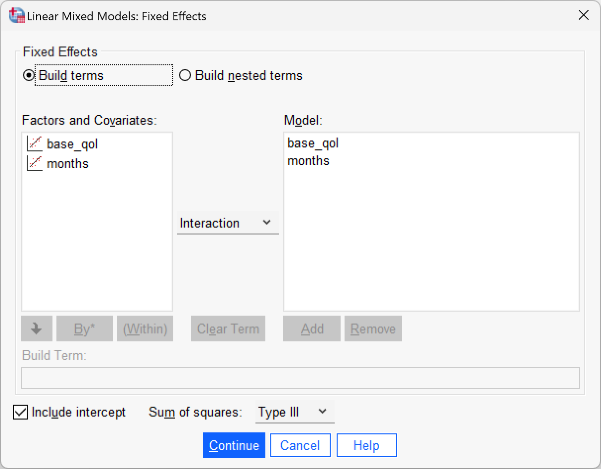
First, split the file by reason by selecting Data > Split File…. The completed dialog box should look like this:
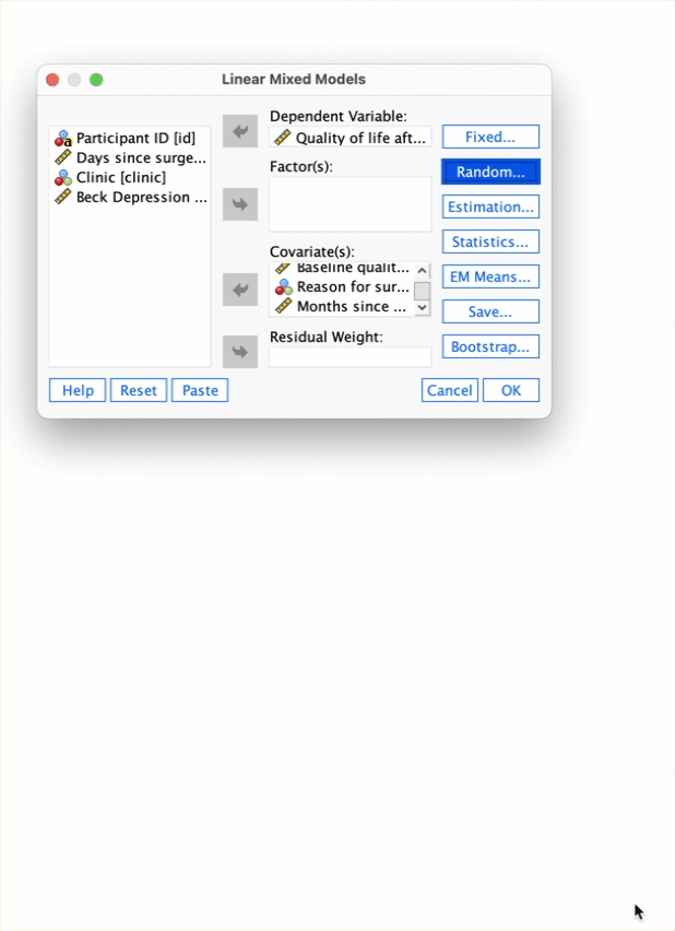
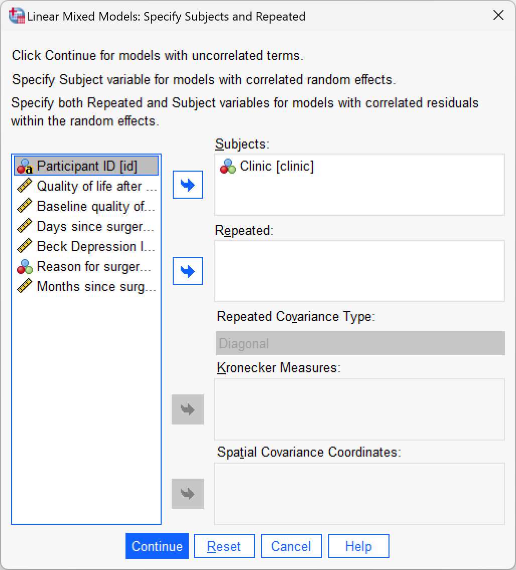
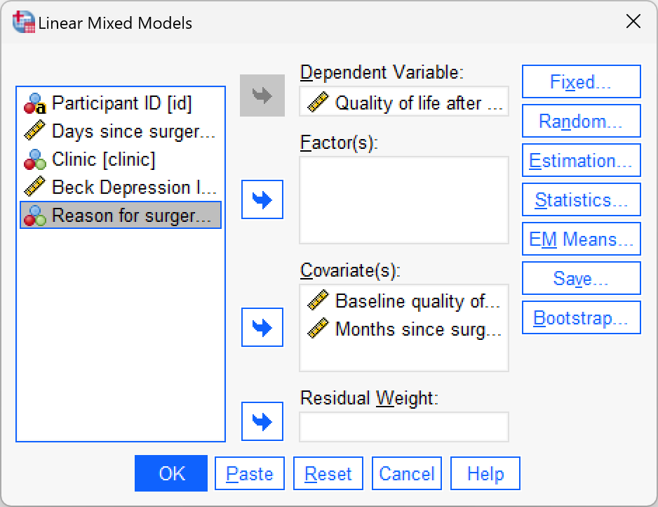
To run the multilevel model. Select Analyze > Mixed Models > Linear… and specify the contextual variable by dragging clinic to the box labelled Subjects (or click ![]() ).
).
Click to move to the main dialog box. First drag post_qol to the space labelled Dependent variable (or click ![]() ). Next, drag
). Next, drag months and base_qol to the space labelled Covariate(s) (or click ![]() ).
).
To add the predictors (base_qol and months) as fixed effects to the model, click  to activated the Fixed Effects dialog box, then, make sure that
  is set to
  and select these variables and click
  . Click to return to the main dialog box.
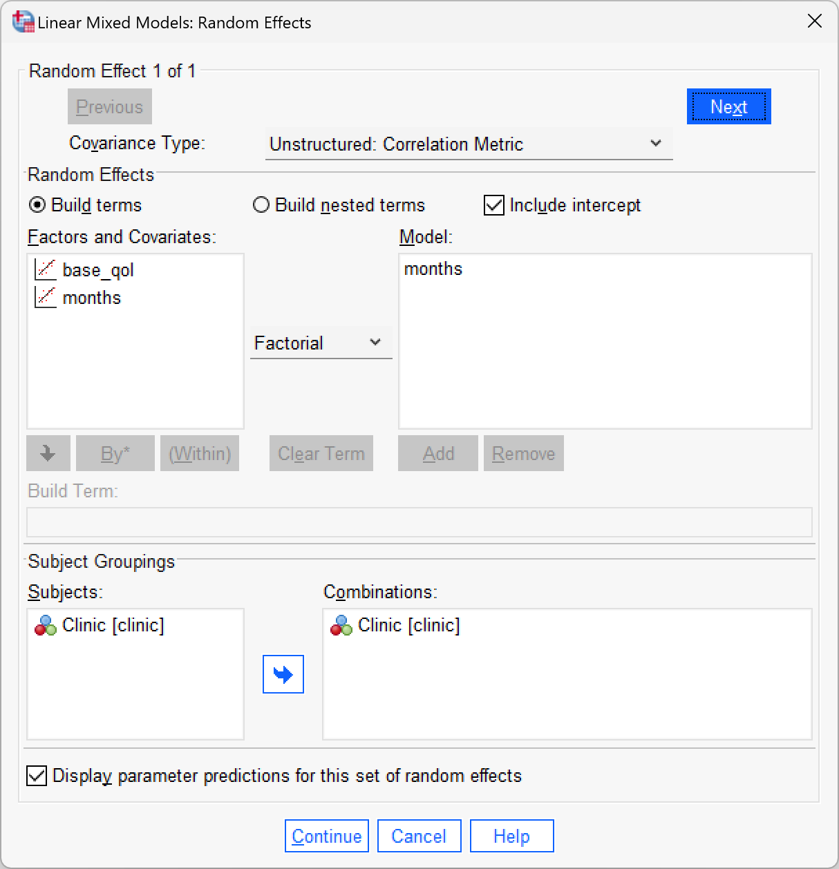
We now need to ask for a random intercept and random slopes for the effect of months. Click  in the main dialog box. Drag
 clinic to the area labelled Combinations (or click ![]() ). Select
). Select  to allow intercepts to vary across contexts (i.e., a random intercepts model). Next, add
 months to the model by selecting it in the list of Factors and Covariates and clicking . Finally, to estimate the covariance between the random slope and random intercept click  to access the drop-down list and select
  .
.
Click on  and select
  . Click to return to the main dialog box. In the main dialog box click and request Parameter estimates and Tests for covariance parameter. Click to return to the main dialog box. To run the analysis, click .